Time for another throwback post - I'm trying to catch up and post more in January - I missed yesterday but doing well apart from that!
My friend and craft teacher Angela moved house last year, so of course I made her a card. I used the same Lavinia stamp for this new home card last year.
The background here is a shaving foam piece, using bundled sage distress reinker. I blended the same colour around the edge to frame it.
I inked up the stamp with different colours of distress oxide in different areas, then stamped. With a water pen, I blended out the colours to fill the house. I also pressed out distress oxide ink onto the craft mat to pick up with the water pen and colour more. The colours are quite random, and bright - I'm enjoying the vibrancy of the oxides compared to the more muted effect of the original distress inks. Although the colours are the same, the opacity makes them brighter. Plus I have more of the brighter colours in oxides I think
Using torn paper as a mask, and the water pen with ink, I added green either side of the house to ground it, and a touch of yellow to suggest a path.
The words were also inked with a mix of distress oxides. I have the alphabet stamps now, so "new" came from "news" again, but I used individual letters for "home".
I like the softness of this card, both in the background and the diffused colour of the inks. I hope Angela liked it too!
This is a post that is long overdue! Last year I did a three part art journalling course with Paula Watkins, (her blog is here) with sessions in September, October and November. I intended to blog each session - that didn't happen!
The course was held at the Open Door, a community hub and art centre that opened last year, and is very conveniently located at the end of my road!
But better late than never. The art journal we worked on is still a work in progress now. But I wanted to share what we produced at each stage, as I completely loved making it!
The first session was paint and stencils, to create background pages to build on later. So much fun building images, layering the stencils, and experimenting with colour.
There was no waste - we started other pages with the waste paint from the stencils and sponges.
I'll build on these over time!
I carried on at home as well, with waste paint from other projects - the journal tends to be on the side ready whatever I'm doing these days.
The second session was tearing, punching and drawing!
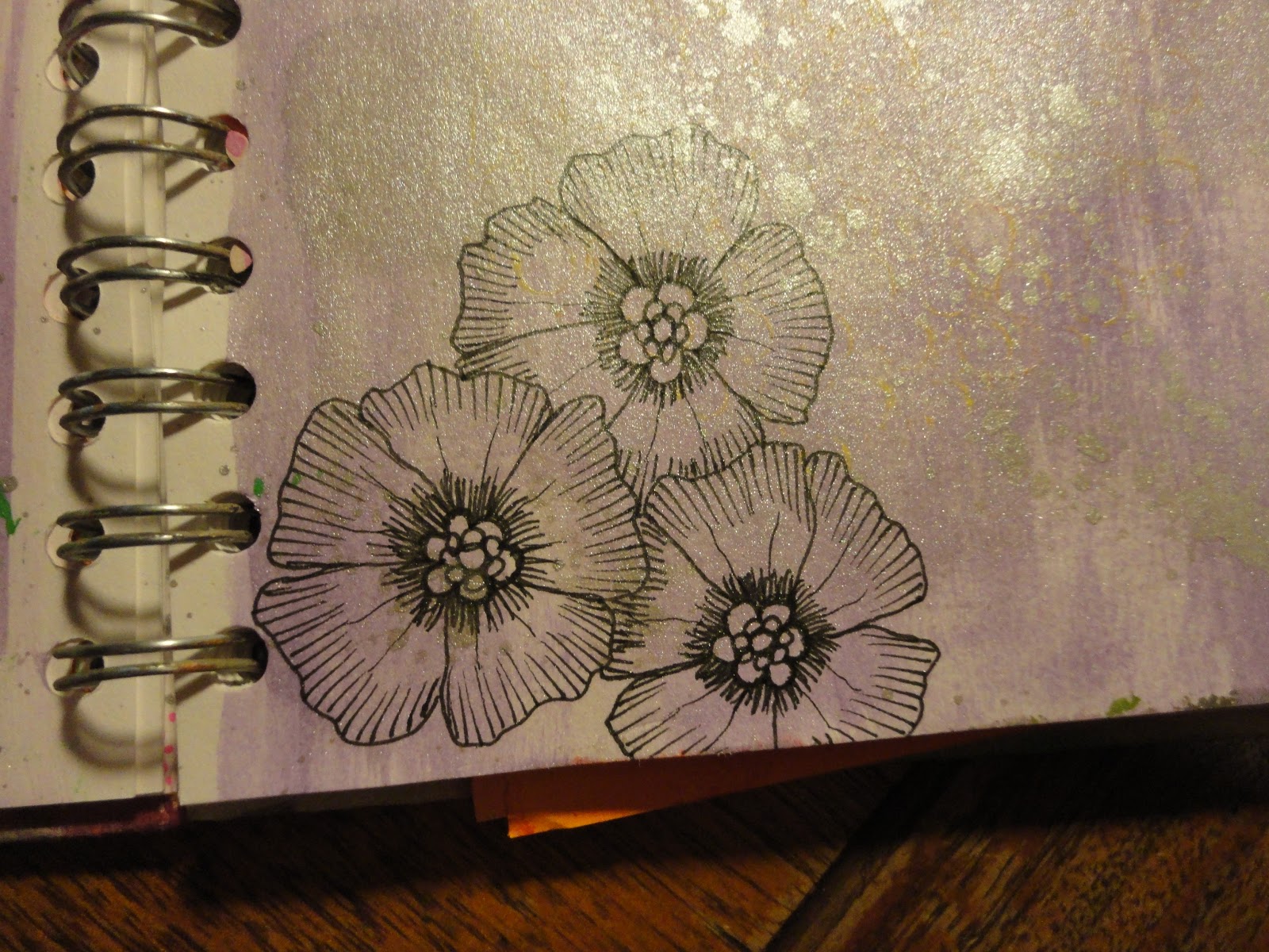
This is a much slower process, so we did some in the class, more at home, and there's a long way to go. I still have the pieces that were ripped off and punched out, to add back to these or other pages. I really like the doodling, but I absolutely loved the flowers Paula taught us to draw - for someone who can't draw, I was so chuffed with these!
It also proved expensive - the next time we went shopping I "popped" into Paperchase, and this happened:
Two black drawing pens were added shortly after from the art shop! But I am now very well supplied for drawing! And finding many uses for the pens.
The final session was die cutting, embossing and collage.
These pages looked great in plain white, but I have been brave and covered one in black gesso. The next stage will be to add more colour to highlight the shapes and patterns. I came away with a stash of spare shapes etc, and I have loads of embossing folders and dies at home to play with as well.
Now I have to decide which of Paula's courses I want to do this year! And the Open Door workshops for this term are going up at the moment, so there's more temptation for me!
Today I wanted to share a card I made for a little girl who turns two this week, Lily.
However, I then realised I'd never shared her first birthday card!
This was quite a simple card, using an inky mop up background from the blending mat.
I added interest with these frame stamps from Stamps Away. I used dusty concord distress ink, to tie in with the background. I've never used these stamps as frames, but they make great abstract patterns.
To finish, I added the words in black archival, with the word chain "Happy Birthday" and the word chain alphabet stamps for the name. I edged with a purple sharpie.
This year's card is a little more involved.
I wanted to use the framework circles stencil from Clarity, I love this and the square one. They're so simple - nine apertures evenly spaced in a square - but so many things to do with them! For a 5x7 card, I only used 6 circles, masking the others.
(I took photos of the process, but they were completely blurred until the final steps! I guess the glossy stencil is hard for the camera to focus on.)
I used my oval petite gel plate to add ink to each aperture - a plain layer then a pattern with a stencil. For the green circles I used old paper and mowed lawn distress ink, with tattered rose and worn lipstick for the pink. The colours were Bethany's choice!
The stencils were the petite dotty wave, petite leafy swirl, petite script and zig zag, all from Clarity. I used a sponge to clean the ink off the stencil into the apertures, which gave a crisper edge to my inked circles.
I then added some stamping, using the small leafy swirl stamp from Clarity, and old paper, mowed lawn and worn lipstick inks. I used the circle stencils that come with the framework, the "waste", to ensure I didn't go into the adjacent apertures.
Having cleaned the stencil, I then added the words, using memento black ink.
I used the word chains as above. However, I decided to swap out the "B" in Birthday, for something a little prettier. I masked the B on the stamp when I inked up.
I was then able to add in the "B" from the alphabet stamps. You can see the difference by comparing to last year's card. which used the same stamps but unaltered.
I definitely had to mask the adjacent apertures when adding the words here!
The final stage was to cut down the card to the appropriate size, then edge. I struggled to find a colour to match, in the end I used the worn lipstick distress marker.
While I was making this, I got out the spine tag from an A5 folder I keep a lot of my A5 Clarity stamp sets in. It's printed on one side, but I turned it over, and added my waste ink, second generation stamping etc as I was going along. I edged with mowed lawn. I used the word chain alphabet stamps, and just had to dig out a "5" from another set.
So now I have a pretty label on my folder as well!
As the excitement of Christmas and New Year draws to a close, we're back with the 52 Christmas Card Throwdown for 2018! We've reverted to weekly challenges, helping you to build up your stash of Christmas cards through the year. Each month we'll have a sketch, a colour challenge, a theme and a stash/technique challenge.
We start with a sketch:
Although this sketch immediately suggests layers, I decided to be contrary and use masking instead. And I wanted to play with my gel press plate and acrylic paints.
I started with 7x7 card. The first layer is quite pale - a light sage paint with a pale gold. I used a snowflake mask from that special touch of... I had a few trial runs at this, the gel press works best with some layers built up on it!
I failed to get a focussed photo, but at least you can see the colours!
I then cut a rectangle from copier paper to act as a mask, and sprayed with stick and spray temporary adhesive. I fixed this to the centre of the card.
The next layer was a dark read, with some gold - I wasn't cleaning the gel press between layers so the texture was building up the whole time.
To build up the gold snowflakes, I used the rectangle petite gel press, so I could focus on specific areas.
I then used masking tape to create the banners. I added a teal/turquoise paint, again with the petite plate.
I wanted to give more texture to the red area, so masked off the banner. I used a script stencil from Clarity with a darker gold, and the mini capricious stencil from The Crafter's Workshop with burnt umber for the swirls.
Switching back the masking tape, I added dark gold snowflakes to the teal banner. I used a sponge through the stencil to give a stronger image.
This was the result with all the masks removed.
To add the star, I cut a template from copier paper with a punch, and used the petite gel plate to apply the teal paint - repeating to give better coverage. I then applied some gold through the swirly stencil, still with the star mask in place.
The final painty step was the sentiment - using a Clarity stencil I got for Christmas.
I used the teal paint, with the sponge to give a solid colour.
I was really pleased with it so far!
The best thing about the gel press plate is the cleaning up - I usually get the best prints with what's left on it at the end. I add a background colour of paint and pull prints to get as much off the plate as possible. I know some people get the plate clean like this, I never get it all off - maybe it's the paint I'm using.
This was my favourite clean up print from this session - absolutely gorgeous, no idea what I'll do with it!
Once the paint had completely dried, I trimmed my sketch piece to fit a 7x7 card blank (so although it's one layer it won't go in the post with a normal stamp - must try to be more post aware this year!).
I then got out the drawing pens to add details. I used gold and bronze around the outside, the shapes, the star and the lettering, and a thinner gold pen within the letters for interest.
I then used charcoal and Faber Castell pencils to add a drop shadow to the shapes, to add dimension, and look like the layers I had decided not to use! It's quite a clumsy effort, but still gives the effect.
And so I'm off the mark, with my first card of the year made!
To see the other great inspiration from the design team, and join in with our sketch challenge, head over to the 52 Christmas Card Throwdown page. You have until midnight GMT (7pm EDT) on Friday 12th January 2018 to enter.
Good luck, I can't wait to see what you'll come up with!
I though I'd share a couple of cards I made a few months ago, playing with the distress oxides.
These were both for children, a friend's son and a friend of my daughter's.
I used a set of wooden block mounted dinosaur stamps. We found these in a charity shop and got them for my daughter to use, but Mummy borrowed them on this occasion. I see it as pre-emptive - I'm sure my stash will be borrowed more than once over the years to come!
I covered stencil card with the stamps in a variety of bright oxide colours. Ravi's was reds, oranges and yellows, Caitlyn's more of a mix, with blue, pink, red green and yellow.
I forgot to take photos of the "before", but got this one of the "during", once I'd spritzed with water.
Once dry, this was what they looked like:
Still recognisably dinosaurs for the most part, but with a bit of a mix up! Using different colours together like this, you really see the difference in how they react - some move much more than others. I did Ravi's first, and held back with the water a bit more on Caitlyn's - the colour moves more than I anticipated after you finish spritzing, whilst drying.
To make up, I simply stamped Happy Birthday and the appropriate name in black archival ink, edged in a black sharpie, and mounted on a card blank.
I think these are a lot of fun - bright and cheerful, and, well, dinosaurs!!