Showing posts with label
Berkhamsted Creative Challenge.
Show all posts
Showing posts with label
Berkhamsted Creative Challenge.
Show all posts
The Berkhamsted Creative Challenge theme this month is "Favourites". These cards, made for the 52 Christmas Card Throwdown, definitely count - as well as using brushos, a favourite product, they are some of my favourite Christmas cards I've ever made!
Branka's theme for the week is "Forest and Deer".
I wanted to use this deer stamp from Clarity that I got last month.
I started by stamping and embossing. I used stazon for the colours, but as this doesn't stay wet long, I used the stamp platform and overstamped in versamark. This allowed me to emboss in clear.
Next I spritzed with water and added brushos for my forest. The square one uses leaf green, orange and olive green. The other uses dark brown and emerald green. The embossed deer resist the water and brushos, and create lovely swirls where the colour moves around them.
This was meant to be the first step, and I'd work over the top, but I loved them so much I left them pretty much as they were.
I cut them down, edged with a sharpie, and used a grey inktense pencil and water pen to ground the deer. On the portrait one I used a yellow pencil to bring out the antlers where the brusho was very dark. I stamped the sentiment on offcuts using the same stazon colours as the deer, and edged.
I love the drama and movement in this one. The sentiment would probably have looked better much lower, but I didn't want to cover the speckled brusho pattern.
This one looks a bit more forest- or foliage-like. The flashes of light I think look quite ethereal and gorgeous.
To join in with this challenge, head over to the 52CCT blog. You have until Friday 24th April to play along.
Last month on the Berkhamsted Creative Challenge, our theme was "Water". I managed a last minute entry, another piece of bunting for our shed!
I was making brusho backgrounds. I'd made a dilute solution with the turquoise brusho, and used it to wet watercolour card. I then added sea green brusho powder to a dry acrylic block, and pressed it into the card.
I re-stamped over the whole area, drying the block and reapplying powder so the sea green stayed more concentrated.
Once dry, I stamped the seahorse stamp from Tim Holtz in potting soil archival ink.
I coloured it using distress oxides (fossilised amber, wild honey, fired brick, vintage photo, black soot) and a water pen.
I didn't cut the triangle before stamping, as I'd misplaced my template!
But it surfaced again so I could complete this one.
To fit the triangle, the seahorse ended up a bit off centre. So I dug out a Clarity stamp that looks like seaweed, and stamped freehand with peacock feathers and cracked pistachio distress oxide. I also edged with peacock feathers.
I hope to get around to weather proofing all the bunting I've made and getting it up on the shed soon!
The May theme for the Berkhamsted Creative Challenge is "Stash - something you've had for ages and never used".
The challenge for this one may be narrowing down the options! Do head over to visit us and join in.
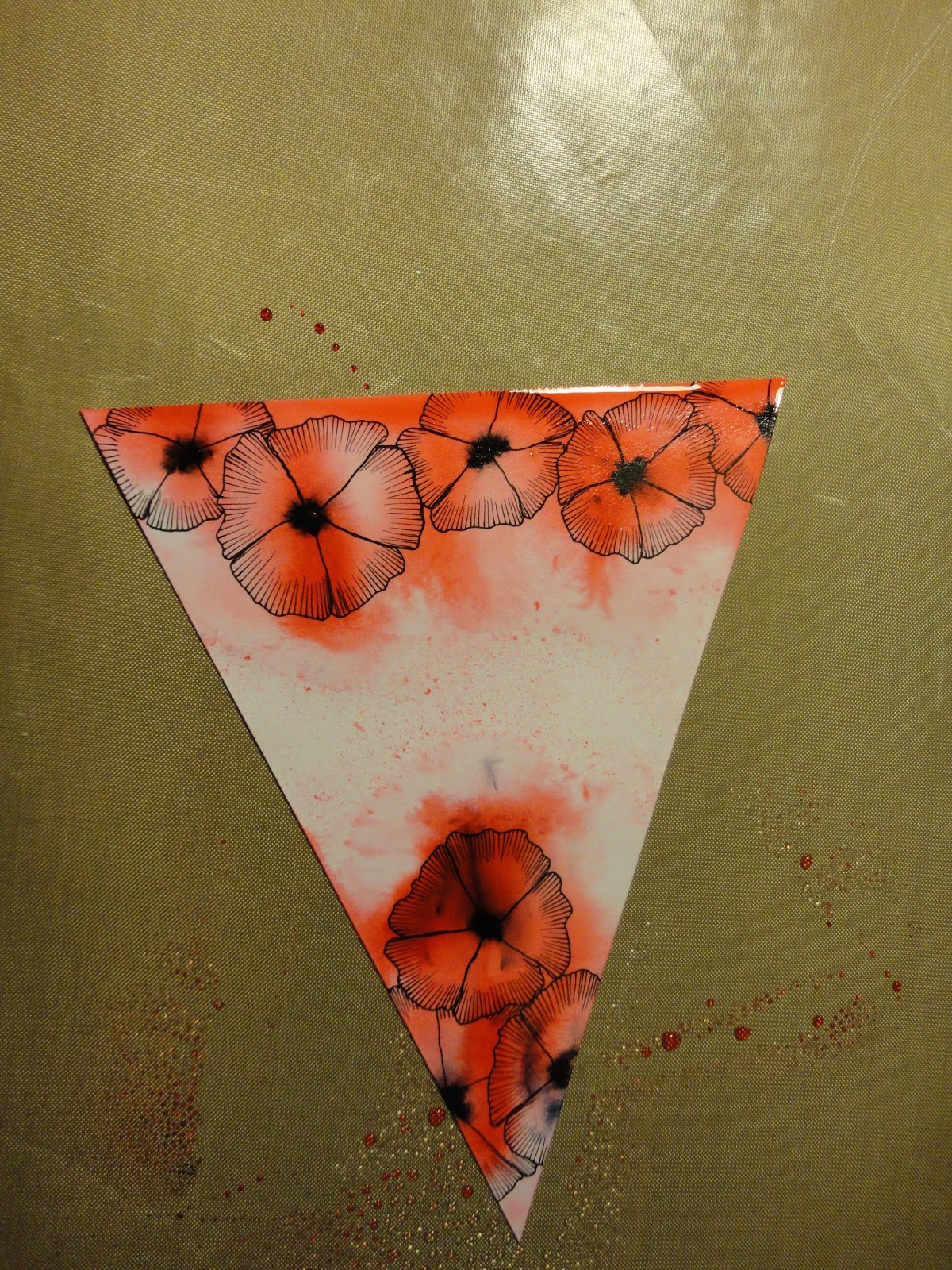
This is another bunting piece that I made - unsurprisingly back in November for Remembrance day. I entered it for the Berkhamsted Creative Challenge "Wise Words" theme.
I started by cutting my triangle from Clarity stencil card. I then drew my poppies - this was just after the art journal class where we learnt to draw these flowers, in various forms, and I was super chuffed with them (still am now!) They look like poppies to me! It was also a chance to use my new drawing pens!
I then wetted the card and added the brilliant red brushos, aiming for the centre of each flower. I added the black brusho, using a paint brush to be more precise, to the centre of each flower.
Once dry, I added more colour, both as powder, and touches with the paint brush using the brusho made into an ink to fill the flowers where needed.
The final step, once it had dried again, was to add the word. This is from a Clarity word chain stamp, and I used archival permanent ink so it wouldn't be affected by the water.
I love the messiness and indiscriminateness of this - it seems appropriate somehow.
Happy New Year!
We have a new theme at the Berkhamsted Creative Challenge for January, "Starts with 'A'"
So to kick off the month, and take advantage of some down time with hubby home to help look after the little one, I thought I'd do a quick bunting triangle. I am collecting a little stash of these now, I must work out how best to weather proof them and get them up!
I started with a background from my stash.
This is ink from my hexagon petite gel press plate, I was obviously stamping through the circles stencil a lot one day, this is the waste.
I cut a triangle using the template I made last year, to ensure my triangles are all the same size!
I then decorated with letter A's. I started with alphabet stencils, both from Clarity, and sponged through with acrylic paint. I then got out lots of my alphabet stamps, and distress oxide inks (as they're nice strong, bright colours) and stamped over the rest of the triangle. One (top middle) was an outline, so I filled with another distress oxide and a water brush.
To finish, I blended fired brick distress oxide around the edge, then vintage photo.
To join in with the challenge, come and visit us on Facebook - anyone is welcome to join (regardless of location!) and we love to get feedback and encouragement for our entries.
It's time for another pink, red and green Christmas Card for the Christmas Card Throwdown.
I was very unsure about this combination when I first saw it, but it's proven a rich seam of inspiration! This is why I love the challenges, it makes you think outside your comfort zone.
This card will also suit the Berkhamsted Creative Challenge "Celestial Wonders".
I've been wanting to try this Northern Lights technique since I saw it last year, I think it was on a sponging technique challenge.
I started with my distress oxides and the challenge colours - fired brick, picked raspberry, twisted citron and cracked pistachio.
I sponged them onto my card in streaks.
My camera doesn't focus on these backgrounds well, this was the best photo of several!
I then took the black soot oxide and sponged round the outside, and a little over the lights. I used a torn paper mask to add a hill at the bottom.
For a focus, I added some trees along the horizon. I used memento ink as I wanted them to be crisp. These are a selection of Clarity stamp trees - I used the top half as I wanted them smaller than the full stamp.
Where the trees showed on the black hill, I sponged over again in memento to blend them in.
While that dried, I had another go, using the normal distress inks, to see how they compare. This one isn't in the challenge colours!
As I wasn't restricting myself, I added chipped sapphire around the edge first, then black soot over it.
This gives a deeper, more velvety effect to the night sky.
In general, the colours are more vibrant, and the black darker, so for this I think the normal inks are a better choice. Having said that, I didn't add water to the oxides - I suspect that a light spritz might activate them and give a whole other effect. One to try another time!
I added the trees as before, first and second generation.
Once they had dried, I added stars with a white gel pen.
I also darkened the sky of the oxide one with normal black soot ink.
For a sentiment, I stamped the top half of a Clarity Christmas stamp, using versa mark and white embossing powder.
To finish, I mounted on card - pink for the oxide one, purple for the distress ink one, then onto 6x6 card blanks.
I think you could play around with the "shape" of the sky to be more realistic, and with the patterns in the colours. There are lots of videos on youtube with different ways to play with this kind of effect. But even a fairly basic version like this is (I think!) very striking and effective.
To join in with our colour challenge, head to the Christmas Card Throwdown, where you'll find lots of inspiration from the design team and the other entries.
As there are 5 Saturdays in September, this challenge is open for three weeks, so you have until Friday 6th October to enter.
The July theme at the Berkhamsted Creative Challenge was "Live, Laugh, Love".
I didn't quite get anything made in the month, but did make these bunting pieces while on holiday in August. And it's taken until now to blog them!
The idea of making the bunting is to use up some of the huge pile of backgrounds I have built up in my stash. I pulled out these three to use.
Let's start with "Live". The background for this was really intense, so I wanted to tone it down a bit. I used a white gel pen to draw cross hatches across large areas to break up and lighten the colour. It worked better than I'd hoped.
I then used cracked pistachio, broken china and vintage photo distress oxides, blended round the edges and applied though a dotty stencil.
I stamped the word with cobalt blue archival ink.
To finish it off, I scribbled round the edge with the white gel pen, and edged the words and some of the stencil dots.
"Love" was the easiest piece as the background was so pretty it did most of the work. It was made with purple, ultramarine and emerald green brushos, on watercolour card.
I simply edged the triangle with broken china distress oxide, then stamped the word in black archival and highlighted it with the white gel pen.
Finally, "Laugh". I used the rainbow background, made by smooshing distress ink with water between plastic sheets, then adding the card and pressing.
I wanted to add more texture, so tried out an idea on scrap card. Stamping with distress oxides and stencils. They are thick and creamy enough that it works beautifully, with a light spritz of water, and a bit of pressure through copy paper. You don't need an embossing machine like normal inks (which is as well as I didn't have one with me!)
I used the petite leafy swirl stencil from Clarity, and added colour in each rainbow colour to match the background.
As a bonus, I got this piece from inking up the stencil, which is now decorating my phone case!
I also blended colour round the edged of the triangle to frame it a little, again matching the rainbow colours.
I stamped the word "Laugh" using the Clarity alphabet and black archival ink. It wasn't a perfect stamp, and the spacing, that I'd wanted to be loose and free, was a bit too chaotic. The "a" gets lost.
I tied it in by tidying up the letters with a permanent pen, then edging with a yellow distress marker, then red distress oxide painted around with a water pen.
I'm still not happy with that "a", I might try to cover it with something else one day.
For a final touch, and to frame it more, I used a music stamp around the edge, stamping freehand without a block.
So, another three pieces of bunting for my shed. I used up some of my stash as well, although in this crafting session I made 5 more (not including the one that went on my phone) so I'm not sure I can call that a success!
Our current Berkhamsted Creative Challenge is "Celestial Wonders", do come over to Facebook to see what's been shared.
Our September theme at the Berkhamsted Creative Challenge is Celestial Wonders.
So I thought I'd knock up another couple of pieces of bunting - at this rate it'll take a while to have enough for even one side of the shed, but I guess there's no rush! I have fun making them, it's nice to have the pressure off a bit, if they're not perfect I'm not giving them to anyone, like a card or present. It's a bit like art journalling in that I just get to play.
The first started with Clarity stencil card, that I flicked pebeo masking fluid onto.
For the base colour, I applied dusty concord and chipped sapphire distress ink to my blending mat, added water then dipped the card in. While it was wet, I added purple and ultramarine brushos.
When it dried, this was the result.
I rubbed away the masking fluid to reveal white "stars".
I cut my triangle out...
.... and blended dusty concord and black soot distress ink around the edge.
I then used a groovi tool to add white acrylic paint for more stars, and a white pen for joining lines, to spell out "ASPIRE" in the style of constellations.
I wish I'd planned this a bit more, it looks very scrawled. I think if I'd spread it out more and gone from top left downwards, it would have been better. But this is just play!
With some of the waste card, I cut out moons and stars using a punch. (I found the punch in the BAC sale last weekend and had to have it for this challenge!)
I cut a triangle from black card, and blended distress oxide over it - wilted violet, a bit of faded jeans and black soot. I then stamped a pattern of tiny stars all over in the wilted violet - the opacity of the oxides mean they show up on black.
With the same oxide ink, I stamped a "wish upon a star" sentiment. This came from a Christmas set I got with a magazine this weekend.
I cut more stars from the scrap card, and stuck all my punched pieces to the base.
I highlighted the words with a white pen so they stand out more.
So I have two more pieces to add to my bunting chain now.
To join in with the challenge, come over to Facebook and visit us. It's a fun group, the idea is to encourage and inspire everyone to have a go at creating.