Pages

Showing posts with label Clarity Stamp Challenge. Show all posts

Tuesday, 31 January 2017

Chameleon hare


The first Clarity Challenge of the year has the theme Animal Kingdom.

This is quite fortuitous, as I got the hare stencil for Christmas,  in order to make a picture for my mum's birthday at the end of January. She loves hares, so I thought of her as soon as I saw it.

I wanted to make a canvas for her, as I love the texture. I tried the stencil on various sizes - I wanted the main image to be quite close in to the hare - and found that it fits beautifully onto a 6x6 canvas if you tilt it. And that this then fits onto an A4 canvas at an interesting angle.

I started with the background of the 6x6. I wanted to make it quite natural, and quite bright rather than moody. I brushed on acrylics, then added the grass with the side of an acrylic block.


I was really pleased with this, but then I added the hare, with texture paste. I coloured him/her with distress ink, and brushed ink inside the hare shape as well, but it really wasn't working for me (the photo looks a bit better than I thought it did in real life!)


The shape is too abstract for such a literal background I decided. So late one night, this happened....


Working with it and playing around, I got to this...


Which I liked, and was going to colour the hare a grey metallic to match some of the dots, then decided that it was a bit too out there for my mum, and not what I wanted.

So I gesso'd over the top in white, and went to bed!


The next day, I added the green (hey pesto is the colour - it's translucent so it needed the white underneath to be this vibrant).

I followed a similar path to the night before, but in more natural colours. I dry brushed white metallic over the background, mostly on the right, then added dots in this and burnt umber with a bit of gold mixed in.


The hare was also painted in the brown and gold mix, and I dry brushed inside the shape a little. The eyes I painted with the solid brown, to make them stand out a little. I ran a sponge with the brown and gold on around the edge to frame it.

The background was developing alongside this piece, and trying to keep up with the changes! I divided the A4 canvas into 4 areas.


They had quite different base colours, but the idea was that as I added colours they would tone in together more. I used the birch trees stencil top left, the NDC trees top right, the 2 in 1 curly strip bottom left, and the wild flowers bottom right.


I like them all individually here, but they don't hang together as wells I'd like, or with the hare (in its final incarnation!). So I added more dots, in the brown and gold, to the top right and bottom left, which were a bit stark and plain. It still needed softening - it is the background, so I didn't want it fighting with the main image. So out came the punchinella. It really is a life saving piece of kit! I sponged the brown/gold and the metallic white through in patches. I particularly like the effect over the wildflowers, I'll use this combo again for a background.


I think this is part way through the process of adding it. The metallic white doesn't show well unless it catches the light.

I edged this canvas in the same way as the smaller one.

The final touch was to define the vertical lines between the sections. I tried adding a row of the dots, but they went really wonky and uneven, and looked awful! For plan B I painted a scrap strip of stencil card with the brown/gold mix, then die cut it. I think the die is meant to be rolled to make a flower, but it fitted this purpose very well. I attached it with PVA, and wrapped it around the back of the canvas.

The 6x6 went onto the A4 with a double sided adhesive sheet, then I decided it needed a further frame, as it's quite busy, so it went onto an A3 canvas, with another adhesive sheet.

This was one of those projects that I really wasn't sure where it was going when I started. Although even if I had, the plan derailed pretty quickly!

It was a lot of fun playing, experimenting, and finding other routes when one didn't work. Painting right over something you've been working on for a while is a bit scary, but liberating at the same time. You always get to start again!


If I did this again I might change the background a bit, but I'm really happy with how the hare has turned out. I got my natural colours, and it's bright and sunny, but is abstract enough to suit the style of the stencil design.


Wednesday, 30 November 2016

Blast from the Past - Clarity Challenge November 2016

ART vs Craft canvas board

It's the last day of the month, so obviously I've been doing my Clarity Challenge entry!

The theme is "Blast from the past". This has been used as a Clarity stamp you've had for a long time, or a challenge theme for the past. I've tried to cover it all ways!

I haven't been collecting Clarity products for that long, but the first stamps I bought were a selection of New Design Club back issues. One was the nautilus, which was issue 7, so I reckon must be quite old! So I've used that.

The first stencils I got were the leafy swirl, abstract squares and flared frame, so I've used the first two. I've also got a wheelie stencil, which I think goes back a bit, so I've used that, as well as the brick work and the curly 2 in 1.

In terms of a past challenge, well, Challenge 1 was "Anything goes", but that seems a bit like cheating, so how about Challenge 15 from May 2014, "It's all about the words"?

I've just started reading and working through Melissa Dinwiddie's book, The Creative Sandbox Way. I've followed Melissa for a while, I love her art, as well as her approach. The book has prompted lots of thinking and conversations about art vs craft, which has led to this piece.

I have been raiding my stash of backgrounds recently, and have used a lot of them in this (more blasts from the past!). I have a lot of gelli prints using the leafy swirl stencil, some which tore and can't be used as a whole.


Gel plate prints using the leafy swirl stencil, light green, red and dark green/blue

I dug these out for my "ART" letters. I remember being so gutted when the red one tore, it looked beautiful through the plate.

I printed out the three letters in very bold, and cut them out as templates, then drew round them on the prints and cut out.


Letters A, R and T cut from patterned card

I roughed up the edges with a craft blade, then mounted them on cream zeta hammered card, and cut round with a border.

For the "CRAFT" letters, I pulled out some scraps, from mopping up ink and cleaning the brayer. I cut squares out with a die (using my amazingly useful nested squares again!)


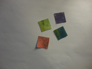
4 squares of card with textured colour

The letters were then stamped with different colours of archival ink. I used the initial letters from word chain words, masking the rest of the word. One day I'll get the alphabet set, but in the meantime I'm getting quite good at this!


Letters A R T in patterned card and C A F T stamped on coloured squares

Before I mounted them, I added vintage photo distress ink to the edge of the ART letters, to tone them down.

More words for the background, using the wheelie stencil. I inked through the stencil onto white tissue, using distress inks and a blending tool.


create, express and explore stencilled onto tissue

All words that resonate with the creative process, whether it's art or craft!

The other element to go on is the nautilus stamps, onto another scrap from cleaning the brayer. I used black archival as it was acrylic paint. (I didn't get photos of these !)

For the background I used an A4 canvas board. I started by adding grunge paste through the squares and curly stencil.


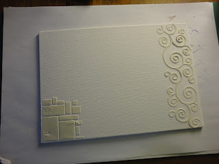
A4 canvas board with grunge paste in squares and curls

When this had dried, I painted it all with black gesso. I then started adding colour, with acrylic paint. I brushed through punchinella, and dry brushed, although as the gesso wasn't quite dry, it ended up a bit muddy. So I dried it with the heat tool (short on time!) and had another go, with lighter colours - a cream, and hey pesto green. I overdid the cream and punchinella, although the mix of the two colours was lovely. I then brought in some cherry red, and got pink where it mixed with cream. This was turning into one of those "keep going till you like it" projects.

I dry brushed cream over the curly grunge paste, which highlighted it nicely.

The squares on the bottom left needed lifting, so I added red dots, then went through the leafy swirl stencil (didn't work), then the brick stencil, which I liked, but it was too pink. So I added purple, and was finally happy!

I tried the leafy swirl stencil on the main area as well, with a make up sponge, but it didn't look right, so I ended up dabbing over with the sponge, and sweeping up from the bottom with it, with the mix of colours that had developed on my palette (a plastic box rescued from the recycling!)


A4 canvas board with grunge paste in squares and curls coloured in greens, pinks and purples

They say it's about knowing when to stop. Sometimes the time to stop is when you have to go and pick your daughter up from the childminder!

The next stage is to get the mod podge out, to add the tissue words and the nautiluses. I had to be careful with the tissue, as I'd used a dye ink and didn't want it to run, but I didn't want to use an archival ink and get it all over the stencil. The tissue more or less disappears, so the words sink into the background, as I'd hoped.


A4 canvas board with grunge paste, nautiluses and words added

After this point, I decided I needed a third nautilus (they say odd numbers look better, turns out they are right!). I dabbed green paint over the two shown here, to merge them into the background a bit more, they looked too clean and crisp.

I added the letters with 3D silicon glue, to stand out a bit. To define the edges of the canvas I ran the black archival ink pad around them.

To mount, I got an A3 canvas board. It looked a little plain, so I added a final touch with one of the pattern stamps, in opposite corners. I used black archival ink, and touched up with a permanent pen - stamping on canvas is a bit inexact!

I attached the two canvases with an adhesive sheet.

And the final thing - I put my initials on the bottom corner.


ART vs Craft canvas board


I had no real idea how this would turn out when I started. The process was a lot of fun (and isn't that the point?), and I'm pleased with the outcome.


Monday, 31 October 2016

A breath of woodland air


It's time for the October Clarity Challenge. And I'm loading it on the last day again! I could try to pretend that I'll do it earlier next month, but it's unlikely. Things tend to get left until they're the most urgent thing at the moment!

The theme is "Circles or Squares."

This idea developed in three stages. I wanted to do something dimensional, so decided on a square canvas, with square frames layered up and extending out from the sides. I even bought a set of square nesting dies to make it, which have proven very useful already.

When I received the gorgeous Clarity Club stencil this month, a set of beautifully delicate trees, I had the idea for a woodland theme, using that and other tree stamps and stencils. 

Finally, at my shamanic bodywork session I drew the forest card, which said "breathe", and gave me my focus.

I started with an 8x8 canvas board. I applied grunge paste through the new stencil, forming a tree up one side and leaves across the centre.


I added more branches across the top, with the same stencil, then individual leaves in the bottom left, using the maple leaves stencil. The only picture at this stage was all blurry!

Once the paste was dry, I spritzed with scattered straw distress ink. Then, replacing the stencils, I added colour with distress inks and stencil brushes.


It was a bit challenging to work out which leaves, and which way round, I'd used at the bottom. This is an Autumnal woodland, so lots of warm colours. I used aged mahogany, spiced marmalade, brushed corduroy and crushed olive.


Before I finished, I decided that the background was too yellow, so painted it with a cream acrylic paint - fiddly, but glad I did it. I also edged the canvas with potting soil archival ink.


For the squares to layer up, I made a series of frames, cutting Centura Pearl card with all the nesting dies together. I wanted the sturdiness of the card, but not the shine, so used the reverse.

I painted the frames with acrylic paint. I used hey pesto and claret, with touches of other colours applied through punchinella - so there are a few circles snuck in as well!


Then to make the patterns and images to be framed.

The main one uses the birch trees stencil, which I love. I started with antique linen ink, brushed over the whole card, then added the stencil and brushed over with mowed lawn, crushed olive, and a touch of pine needles. I darkened the trees with brushed corduroy.


Looking good, but again I changed my mind and decided it was too bright, so added walnut stain over the green later on.

For one of the other panels, I used a tree stamp. I started with brushed corduroy over the card, then inked up the stamp with distress markers in different colours, and stamped three times.


The back tree is second generation.

Very pretty, but too pale, so I added more trees behind, so it's more of a wood, and used the other tree in the set and third generation stamping to fill in the background. I used the side of the tall tree to add bushes at the front. I also went back over the background trees to darken then, which involved masking the front trees - they're not the easiest shape to cut out!

Mounted behind a frame, here's the finished panel.


Next a tiny panel, using the birth trees stencil again, but darker colours - walnut stain trees with aged mahogany between.


Being so small, the branches were a little unclear, so I added detail with the fine nib of a distress marker.

Another small panel, this time using one of the maple leaves. 


This has a crushed olive background, with detail from punchinella, and the leaf is brushed corduroy.

For the other panels, I used acetate rather than card, so the squares behind would show through.

For the word, I used my word chain stamps. I used letters from Brilliant, beauty, truth and love to make the word breathe. Stazon black ink so it is nice and crisp on the acetate.


One of my Clarity Club stamps, the ivy leaves, came out next. I stamped onto acetate using olive stazon, and also with versa mark then embossed in green.

I coloured in from the back with glass paints.


I was going to add white glass paint behind, which is opaque, but my pot is so old it's gone off. So I used white gesso, it took 3 layers.

I also pressed versa mark through the trees stencil and heat embossed in bronze. It was a lovely image, but didn't fit with the rest very well, so I didn't use it, although you can see it on some of the layouts below.

With all the panels mounted in frames, time to arrange on the canvas. I had a plan up front, but when I tried it, I didn't like it. It felt too cluttered, no room to breathe at all! 

So I had a play around.


This was a second attempt, still too busy.

My options were constrained as there was an area of texture paste at the top I wasn't happy with and needed to disguise or hide.


In the end I went with a simple option, not using all the panels I'd made (but keeping my favourites!) which feels much more open and spacious.


To mount, I raided my daughter's craft stash for black fun foam. I cut this to size with the dies to raise up the frames, without obscuring the acetate. Where squares overlapped, I used extra layers to build up and support the non overlapping parts.

I have put a hanging ring on the back, but don't have anywhere on the wall to hang for good photos. So I had to improvise a stand, to avoid bending the bottom square, while I propped it up in the kitchen, where the light is best, to take these shots.


My warm, autumnal, woodland reminder to create space and breathe.

Friday, 30 September 2016

In The Garden - Clarity Challenge September 2016


Wall hanging, 6 squares with the letters G, A, R, D, E, N, each decorated with a garden theme

I'm posting my Clarity Challenge entry on the last day again! At least this month it hasn't been quite the last minute panic of the previous two months.

The theme is "In The Garden", which gives so many possibilities, but I still struggled to come up with an idea that I liked and that worked. After a few false starts I came up with this design, based on the letters of the word Garden.

I spent what feels like hours looking at different fonts in Word to find one I liked. This is called Harrington. I printed it out onto copy paper (my printer wouldn't take stencil card, I did try!). I then traced each letter onto a 8.9cm square of stencil card. Why that size? It's a quarter of a 7x7 sheet.

This where a light panel would have been very useful. I had to improvise with the light box I have for SAD, laid on its back with a large acrylic block on top for a smooth surface.


I carefully drew round each letter with a small permanent pen.


And then filled in with a medium pen.


The results aren't a carbon copy, but I think look pretty good.

I then stamped on each square, a different design on each, using black archival ink. I used pebeo masking fluid, both for over-stamping, and to protect the stamped images while I applied the backgrounds.


So let's look letter by letter.


"G" uses one of my favourite stamps, the Daydreamer. In this case, I extended the tree by repeating higher up, and moved the birds from the left of the tree to the right, to extend the bottom part of the image. The birds on flight added balance and interest - there's one more than planned, drawn in to hide a smudge!

I wanted to try making clouds using cottonwool covered with versa mark ink, but it didn't really work - partly as my ink pad is to dirty the clouds were blue (I'm not great at removing the indexing), and the stencil card reacts differently to Clarity Card. The sky is salty ocean distress ink, with bundled sage and spiced marmalade to add warmth.

All the squares were edged with a black sharpie.


"A" uses a butterfly stamp from the New Design Club. I coloured it with a blue-purple pencil. The background uses the birch trees stencil - I've had this for a while and not used it, although I really like it, so good to have a chance to do so. The inks are antique linen with brushed corduroy and a little ripe persimmon.


"R" has a flower border stamped with the bouquet stamp, and coloured with pencils. The lawn background is mowed lawn (appropriately) with stripes (using the stripes stencil) of bundled sage, to try to tone it down. I hadn't planned these, but got a stripe from the brayer which these disguise perfectly, and I think they work well. I blended iced spruce over the top of it all, to tone down the mowed lawn some more, as it was virtually luminous to start with!


"D" is possibly my favourite, a garden pond scene. The water lilies are from a Japanese set I got from one of the workshops. I masked off the tall stems, to look more realistic and fit the scale better. They're coloured with pencils again. The rushes at the bottom are two wee flowers stamps. I don't think the one is meant to be bull rushes, but that's what it always looks like to me, so it goes in my pond.

The water is bundled sage with a touch of salty ocean. I ran the brayer over crumpled paper before brayering the card, to give the watery texture. It doesn't show that well in the photo, but has worked well.


"E" is where I had a bit of a disaster at midnight last night!

The stamp is a recent New Design Club image, with a bird from the Christmas sentiments set added. They're coloured with pencils. The background uses the maple leaves stencil (another first time use!). I used the "innies" first, with antique linen ink, and a make up sponge.


They were a little indistinct, so I went back with the "outies" and added darker colour - brush corduroy I think. This gave a little halo around the leaves, which I really like. I went over the whole background with a brushed corduroy and ripe persimmon mix, to warm it up.

So far, so gorgeous. Unfortunately, when I was edging with the sharpie, I had a momentary lapse of attention! Hence the black line at the bottom right. No way to remove it, so I had to hide it. I went with another bird - I wanted it facing the other way, so stamped onto scrap, and traced it in reverse with the permanent pen. My light box was pressed into service again. Not perfect, but acceptable. Maybe if I'd slept on it, I'd have stamped another leaf on a separate piece of card, cut it out and stuck it on.


"N" is maybe the prettiest letter. It uses another New Design Club stamp, the carnation. The background is brayered with salty ocean and dusty concord. I was going to colour with pencils again, but my set doesn't have any pinks! So I painted with distress inks. The main colour is seedless preserves, watered down, with picked raspberry and unwatered seedless preserves to add depth. The stems are mowed lawn.

I also used grey pencils to add drop shadows to each square.

To mount, I found, fortuitously, that I had a die that fits well for the square size, it's from a spellbinders set. I then decided that to tie in, I needed a thicker black line round the edges of the squares, so had to go back with my sharpie, and a ruler this time. You can imagine how careful I was!


I cut the die 6 times, in black card, and attached each letter to one.

I then joined them together on a woven textured ribbon, with a large jump ring at the top to hang it from. This was silver, I sprayed it with a little gold to tone it in.


Part of wall hanging, 3 squares with the letters G, A, R, each decorated with a garden theme


Here's a close up of the top half - of course, something long and thin is difficult to photograph and doesn't really work for thumbnails!


Part of wall hanging, 3 squares with the letters D, E, N, each decorated with a garden theme


And the bottom half.

I think I could use each of these little scenes separately for cards etc. The "E" would make a lovely Christmas card.


Wall hanging, 6 squares with the letters G, A, R, D, E, N, each decorated with a garden theme


There you have it, my take on "In The Garden".

I wish my garden were as pretty, and varied, as this!