Friday, 4 November 2016
Swirly Noel
The fifth challenge of the month of October for the 52 Christmas Card Throwdown is pick a previous sketch. I have gone back to July 2013 for this one:
The technique I've used is based on Leonie Pujol's stencils and masks, and matching stamps. She hasn't brought out the Christmas sets yet (she admitted the other day they weren't done in time for this year - so they'll come out next June - I'll be looking out for them!) So I'm rather cheekily doing the same approach but with a Clarity stencil, and a mix of Christmas stamps.
I started by putting stick 'n' spray on the back of the stencil, letting it dry a bit, then applied it to Clarity stencil card.
Using a blending tool, I applied antique linen around the stencil.
I went though all my stamps and pulled out all the small Christmassy ones, including some swirls and embellishments.
Using archival black, I started stamping around the stencil.
I chose archival black for a crisp finish, although it doesn't wipe off the stencil. I used stazon cleaner when I'd done, and most of it came off, although it doesn't look like new! A dye ink would be better for that, but I only had distress ink, which isn't so crisp.
I gradually added stamps, building up the area around and inside the stencil.
The finer stamps work better, and I like the swirls extending the image out. It goes quickly once you get going, and is
quite fun. It would be nice to do one with mainly snowflakes. I'd also like to try doing it with versa mark and adding mica powder, but that would end up as a blue card with silver or gold, and after three blue cards already this month, I wanted to go for something different.
Once I was happy with the stamping, time to lift off the stencil.
I think Leonie's stencils are wider than this one, so give a bit more of a dramatic void, and I could use a darker colour ink, but it's still a nice contrast with the busyness of the stamping.
I added colour with pencils, and used grey around the "Noel" to emphasise it. I then trimmed back the image and edged with a black sharpie.
I made the line thicker before finally constructing the card.
I had a few goes at the tilted panel behind the topper.
I wanted to try a technique I saw on Mister Maker (a children's art show my daughter watches) using wetted tissue to stain the card.
I laid the strips over wetted card in both directions, in Christmassy colours, and stuck them down with more water. After it dried, I brushed the strips off, to reveal the stain.
Not really the tartan pattern I was expecting! I think maybe my colours were too dark, and I used different brands of tissue from my stash, which bled unevenly.
So next I tried aged mahogany and pine needles distress inks, dragging the pads directly onto the paper to give a tartan like effect.
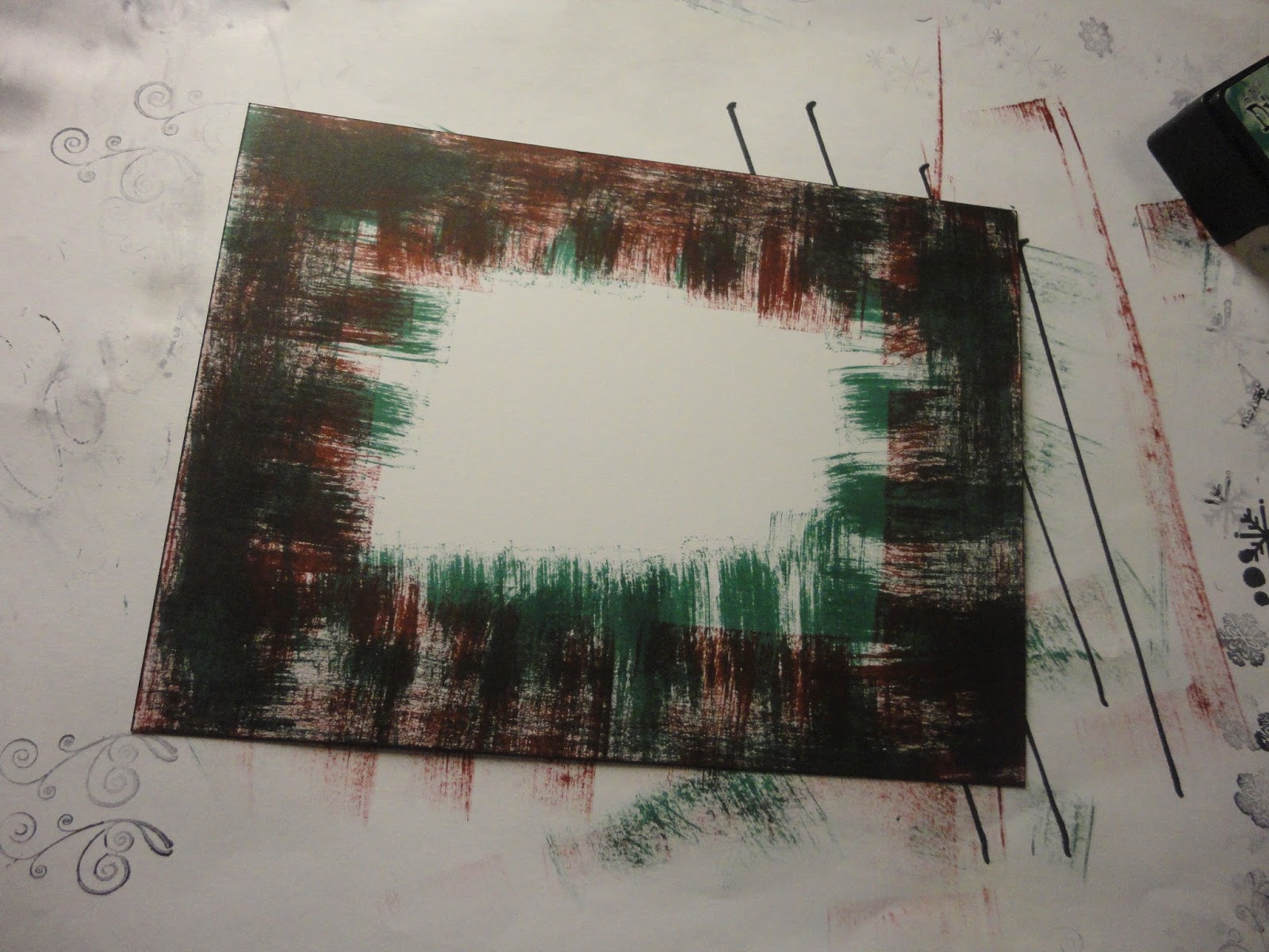
Not great either, I think these colours are too dark again, the technique looks lovely with lighter colours.
Third time lucky (otherwise I'd have been searching through my design papers for a tartan or similar!), I blended aged mahogany around the card, then overstepped in the same ink with one of Leonie's stamps, a swirly pattern.
For the base layer, I used pine needles ink and a little star stamp from Lavinia's stamps, that I'd used on the topper.
I love the delicacy of this stamp. However, in this colour it's a bit strong for a background. I brushed more of this ink over to tone it down a bit.
I put the card together on an A5 base, using foam tape to lift up the top two layers. I then decided the topper needed a little lift, so added some gems on two corners, and tiny ones into the stamped pattern, in the centre of the snowflakes mainly.
And I took my photos.
Unfortunately, I then decided I didn't like the background, it fights with the main image too much. And my "in bed at a reasonable time" last night turned into "a late night".
I gently eased the top layers off the card (which I kept in case it works with another design - waste not want not!). And had a bit of think about what to do instead. Maybe the same in a softer colour?
In the end, I went for an embossed layer, in plain white. It's a swirly pattern, which fits better with the topper than the stars, which looked a bit spiky.
I edged the card with black sharpie first, then used a tattered lace embossing folder. It was smaller than the card, so I had to extend the pattern; there's a slight line at the overlap, although the pattern is continuous, but it's disguised by the toppers.
So here's take two.
A fair few false turns to get to this final card. But hopefully some learnings along the way.
I can't wait to play with this technique some more, it's very satisfying. The only problem will be working out where all those stamps I pulled out belong when I come to put them away!
Monday, 31 October 2016
A breath of woodland air
It's time for the October Clarity Challenge. And I'm loading it on the last day again! I could try to pretend that I'll do it earlier next month, but it's unlikely. Things tend to get left until they're the most urgent thing at the moment!
The theme is "Circles or Squares."
This idea developed in three stages. I wanted to do something dimensional, so decided on a square canvas, with square frames layered up and extending out from the sides. I even bought a set of square nesting dies to make it, which have proven very useful already.
When I received the gorgeous Clarity Club stencil this month, a set of beautifully delicate trees, I had the idea for a woodland theme, using that and other tree stamps and stencils.
Finally, at my shamanic bodywork session I drew the forest card, which said "breathe", and gave me my focus.
I started with an 8x8 canvas board. I applied grunge paste through the new stencil, forming a tree up one side and leaves across the centre.
I added more branches across the top, with the same stencil, then individual leaves in the bottom left, using the maple leaves stencil. The only picture at this stage was all blurry!
Once the paste was dry, I spritzed with scattered straw distress ink. Then, replacing the stencils, I added colour with distress inks and stencil brushes.
It was a bit challenging to work out which leaves, and which way round, I'd used at the bottom. This is an Autumnal woodland, so lots of warm colours. I used aged mahogany, spiced marmalade, brushed corduroy and crushed olive.
Before I finished, I decided that the background was too yellow, so painted it with a cream acrylic paint - fiddly, but glad I did it. I also edged the canvas with potting soil archival ink.
For the squares to layer up, I made a series of frames, cutting Centura Pearl card with all the nesting dies together. I wanted the sturdiness of the card, but not the shine, so used the reverse.
I painted the frames with acrylic paint. I used hey pesto and claret, with touches of other colours applied through punchinella - so there are a few circles snuck in as well!
Then to make the patterns and images to be framed.
The main one uses the birch trees stencil, which I love. I started with antique linen ink, brushed over the whole card, then added the stencil and brushed over with mowed lawn, crushed olive, and a touch of pine needles. I darkened the trees with brushed corduroy.
Looking good, but again I changed my mind and decided it was too bright, so added walnut stain over the green later on.
For one of the other panels, I used a tree stamp. I started with brushed corduroy over the card, then inked up the stamp with distress markers in different colours, and stamped three times.
The back tree is second generation.
Very pretty, but too pale, so I added more trees behind, so it's more of a wood, and used the other tree in the set and third generation stamping to fill in the background. I used the side of the tall tree to add bushes at the front. I also went back over the background trees to darken then, which involved masking the front trees - they're not the easiest shape to cut out!
Mounted behind a frame, here's the finished panel.
Next a tiny panel, using the birth trees stencil again, but darker colours - walnut stain trees with aged mahogany between.
Being so small, the branches were a little unclear, so I added detail with the fine nib of a distress marker.
Another small panel, this time using one of the maple leaves.
This has a crushed olive background, with detail from punchinella, and the leaf is brushed corduroy.
For the other panels, I used acetate rather than card, so the squares behind would show through.
For the word, I used my word chain stamps. I used letters from Brilliant, beauty, truth and love to make the word breathe. Stazon black ink so it is nice and crisp on the acetate.
One of my Clarity Club stamps, the ivy leaves, came out next. I stamped onto acetate using olive stazon, and also with versa mark then embossed in green.
I coloured in from the back with glass paints.
I was going to add white glass paint behind, which is opaque, but my pot is so old it's gone off. So I used white gesso, it took 3 layers.
I also pressed versa mark through the trees stencil and heat embossed in bronze. It was a lovely image, but didn't fit with the rest very well, so I didn't use it, although you can see it on some of the layouts below.
With all the panels mounted in frames, time to arrange on the canvas. I had a plan up front, but when I tried it, I didn't like it. It felt too cluttered, no room to breathe at all!
So I had a play around.
This was a second attempt, still too busy.
My options were constrained as there was an area of texture paste at the top I wasn't happy with and needed to disguise or hide.
In the end I went with a simple option, not using all the panels I'd made (but keeping my favourites!) which feels much more open and spacious.
To mount, I raided my daughter's craft stash for black fun foam. I cut this to size with the dies to raise up the frames, without obscuring the acetate. Where squares overlapped, I used extra layers to build up and support the non overlapping parts.
I have put a hanging ring on the back, but don't have anywhere on the wall to hang for good photos. So I had to improvise a stand, to avoid bending the bottom square, while I propped it up in the kitchen, where the light is best, to take these shots.
My warm, autumnal, woodland reminder to create space and breathe.
Friday, 28 October 2016
Sparkle snowflakes
Having missed last week's 52 Christmas Card Throwdown challenge, as I was away for a few days, I'm back this week for the technique challenge. They've given us embossing to work with.
Lots of ways to play with this one!
I started with a frame. I blended distress ink onto a sheet of Clarity stencil card. The colours used are tumbled glass, peacock feathers and salty ocean.
I then cut out my frame with my new square stitched dies.
I've got the outside aperture and inside square left over for use elsewhere.
To emboss the frame, I used the Clarity snowflake stencils. I covered them in gold pigment ink (it's more visible than versamark, so you can tell when the stencil is covered), and positioned them onto the frame.
I ran this through the grand calibur, which gives the first emboss (or deboss really)...
...then added platinum embossing powder and heated, for the second emboss. I repeated until the whole frame had been covered with snowflakes.
I also tried a darker blue card, with gold powder.
I like both, so will make another card, but have used the lighter one for the moment.
Time to make something to go in the middle! I tried stamping and embossing various baubles, and die-cutting some too.
But I wasn't that taken with any of them. The frame is quite strong, so needs something that won't be overwhelmed, and none had that wow factor. More bits to go into the stash pile for another card.
After a bit of mulling, I was writing up another blog post on some favours I made recently (see below this post) and realised that one of the techniques I'd used for that might be just the thing.
I started with some co-ordinating blue holographic paper from my stash, and stuck an adhesive sheet to the back of it.
I then turned over and peeled off the other backing sheet, and started adding to the sticky surface. Firstly I used gilding flakes, picking out the gold and blue colours from my mixed pot. Next I added blue glitter, then pale gold mica, and a bit of blue, although I didn't like that as much. Finally, I covered the sheet in platinum embossing powder to fill in the gaps.
I heated the sheet to "develop" the powder, and this was the result.
A lovely textured, shiny, glittery sheet to work with. I'm not sure if this counts as embossing, although it does use embossing powder.
I then die cut it with snowflake dies. You need a good die to go through the plastic adhesive sheet - my tattered lace dies did okay, but a cheaper one I had struggled a bit, and isn't such a clean cut.
Very pretty, you don't really get the sparkle and shine in the photo.
The last piece of the puzzle is a dry embossed background. I tried a few different folders, but chose one of my staples, a dotty pattern from tattered lace. I cut the card to size and edged it with the gold pigment ink before embossing.
This went onto the 6x6 card base first, then the frame. I used thick foam tape all round the frame; it had curled a little through being embossed, so the tape holds it nice and flat.
I used three of the snowflakes, mounted in the centre of the aperture using clear foam pads between the layers for lots of dimension. And finally a pearl in the middle - it really stands out in the photos, it's not quite so dominant in real life!
The end result is quite a delicate card.
Unfortunately, the 3 D snowflake doesn't photograph very well, but the mixture of colours and textures really catches the light.
Another blue card, I seem to be in a blue mood this month! I think this would look lovely in purple and silver as well, or in richer colours, maybe burgundy with copper. When I get some free time to play!
Subscribe to:
Posts (Atom)


