Pages

Tuesday 31 May 2016

Shiny Take Two


This month's Berkhamsted Creative Challenge theme is Shiny  After my first attempt at the start of the month didn't quite go to plan, here's my second take on it.

At the same time as trying the stencil and gilding flake technique, I made some messy backgrounds, with the plastic sheet technique. I've done this loads now, the difference with a couple of these was that I brayered the card with ink to start with, so they have a blue, rather than white, background. 


This is the inks when I first stamp them onto the plastic....


... and how they jump out when I add water and squish them between the layers.

I used tumbled glass distress ink for this, then peacock feathers, salty ocean and chipped sapphire for the messy layer.


And of course, once I got started, I had to make a load more as it's quite addictive!


These are for the stash, one has already been used - I'll blog that soon!

I came back to these - distinctly unshiny - backgrounds yesterday. After dusting with an anti-static pad, I stamped with versa mark, using a background stamp from a V&A collection.

I covered it in micaboss, and heat set. Then I applied silver gilding flakes, and gently rubbed back to give the stamped pattern.


For large areas I prefer a mixed colour gilding flake, but for this kind of line work, silver is just right.

I repeated on the other half of the background, as I liked it so much (and it's not that big a stamp).


I'm very pleased with how this has come out - much more successful than the stencils.

The next thing is, what to do with these sheets. I'm sure you could do some beautiful home decor with this technique, but for now I'll settle for a card - my husband's aunt has a birthday in June, so this'll be lovely for her.

I didn't want to overcomplicate the design, I wanted the pattern of the stamp and gilding flakes to be the main feature.

I simply trimmed the patterns back to the silvered area, and overlapped and mounted onto silver mirror card to fit a 5x7 card base.  I cut "Happy Birthday" from silver mirror card with a Tattered Lace die (actually from the centre of the mount, I remembered to do this for once!). I used a strip of the background that I'd trimmed off (so without the gilding flakes) to cover the join, and make the sentiment readable.


As this will be posted, I didn't use foam tape, just tape pen to put the card together.


Of course, being so shiny, this card is difficult to photograph effectively, but I hope you can see the effect of the silver over the patterned background.


I think this is a very pretty and elegant card, I'll be happy to send it to our aunt.


I'm looking forward to using this technique on Christmas cards - it'll be brilliant for snowflakes, or in gold or copper for holly.


Friday 27 May 2016

Festive Feathery Friends

Christmas card with red and green birds, holly border

The 52 Christmas Card Throwdown Challenge for the week is Little Christmas Critters.


52 CCT theme challenge Little Christmas Critters

The only specifically Christmassy animals I have are reindeer, which aren't little, and I have one elf stamp, but I thought he'd be lonely on his own. I do however have lots of birds, so I decided that they could be given a festive makeover.

I used a Hobby Art stamp, birds on a wire, but split the three birds up by masking the parts of the stamp I didn't want to use. I used archival black ink (yes, it's arrived!) on Clarity 7x7 stencil card.


Three birds, stamped in black, partially masked

This took a bit of planning to get them in the right place - this was planned out on copy paper first. It still wasn't quite right, but close enough for the next step, putting in the ClarityStamp Merry Christmas ribbon writing. I masked parts of the birds, using pebeo drawing fluid, where the writing would go over them.

This is where the clear stamp really comes into its own for lining up, although it's still hard to figure out exactly where it's going to come out. Having the archival ink, which doesn't dry as quickly as the stazon, was definitely a bonus for this.


Merry Christmas ribbon writing with birds, stamped in black

I was pretty pleased with this, and we can address the slight mismatches.

I had planned to make the birds robins, but I realised that only one breast was showing, and I didn't want brown birds (very dull and not very Christmassy). So I decided they would be Christmas colours. I used distress inks, fired brick and pine needles, with a touch of water on a brush, to colour them.


Merry Christmas ribbon writing with red and green birds

The next step was to colour the writing. I wanted a different colour but still festive, so went for seedless preserves, a rich plum.


Merry Christmas plum ribbon writing with red and green birds

At this point I cut the card (7x7 Clarity stencil card) down to fit the image more closely.

I could then stamp my frame. I used an old rubber holly stamp - I've had this for many years, but it's a favourite. I stamped off the edge to form the frame.


Christmas image with red and green birds, stamped holly border

I quite like the black and white look, although it's not right for this card.

Can you also spot the solid holly leaf I stamped under the top bird? It was floating a little, so I gave it something to stand on.

I coloured in the holly with distress inks as before, using mowed lawn and fired brick.


Christmas image with red and green birds, holly border, shimmery writing

As I showed more of the stamp at the corners, this is where the berries show, giving little touches of red there - this wasn't planned but I like the way it works, tying in with the birds.

See the sheen on the writing? I thought it needed a bit of a lift, so I painted over with gold mica powder, mixed with water.

The bottom right corner was looking a bit empty and needed something to add a bit of interest. I recently got a little star cluster stamp from Lavinia's stamps, so I thought I'd use that, as a subtle addition that wouldn't detract from the main design. I stamped with versamark ink (yes, that arrived too!) in the top left and bottom right corners, and dusted with a white glitter mica powder.


Close up of star pattern with white mica powder

It's low key but just adds a bit of background. I could probably have added a few more of these.

To finish off, I edged the card with dark green sharpie pen. The plain white card base (7x7) looked a little flat, so I covered the edges with versa mark pen and added the white mica powder to that too, before mounting the main design  onto it.


Christmas card with red and green birds, holly border

Christmas card with red and green birds, holly border

Three feathery Christmas Critters.

I think my favourite part of this card is the frame. I'll have to remember this to try again - it's pretty easy but (in my humble opinion) very effective, it gives a real festive feel.

Sunday 22 May 2016

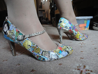
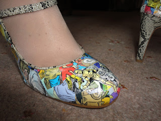
Artoo-De-Shoe

Shoes decorated with Star Wars comic book images

Something a bit different today, and very exciting!

I've mentioned before that my best friend Susan and I like to do crafternoons and try new crafts. It started with my hen do, when we all spent a very enjoyable afternoon making paper flowers, which then adorned the chairs at our reception.

Well, it's her birthday this month and mine next, and a post I chanced to see on Facebook led me back to the page of the lovely lady who ran that hen do crafternoon, Claire Mackaness, and the perfect craft for us to celebrate with; Comic Book Shoes

This one required a bit of preparation to find the materials. I got the shoes on sale for £9 (bargain - they only had one pair in my size otherwise I'd have got more!) then headed for a comic book shop. I think the guy there was quite upset at the idea of cutting them up (hubby wasn't particularly happy either) but they both helped me find a few - including 3 for free - that might be suitable.

So yesterday we headed over to Brentwood to Claire's studio.

The process is basically decoupage. Having said a few weeks ago that I hadn't tried the dedicated decoupage glue/varnish, yesterday I did. Although this itself was a stand in for mod podge, which Claire would usually use. It's a lot thicker and quicker drying than the PVA and water I'm used to. But it reduces the bubbling, so I think is particularly suitable for use with thicker papers.

We first went through the comics to cut out specific images we liked and wanted to use. Having seen "The Force Awakens" last week, I went for the Droids magazine - plus C3PO's gold colour matched my shoes!

We then cut some pages into random small squares for the background. These we applied to cover the whole of the body of the shoe. The glue went onto the shoe first, then the square of paper, then another layer to seal the square down. The glue softens the paper a bit so it curves with the shoe, although some areas were a bit trickier and required much smaller pieces. And some pieces of paper just refused to stick for no apparent reason!


Shoe partially decorated with random pieces from a comic book

I didn't think to take photos of the shoes before I started, but here's one partially covered.

This is what they looked like with the background layer complete.


Shoe decorated with random pieces from a comic book

I've glossed over the process a bit - this took us at least three hours to do!

The next stage was to place the images we'd selected over the background, again applying glue under and over the paper. This went relatively quickly, although you could take ages deciding on the layout you want.

And, with a short drying time, my shoes were finished!


Shoes decorated with Star Wars comic book images

I'm so pleased with these - so here are lots of pictures showing them off!

Shoes decorated with Star Wars comic book images
The glue doubles as a varnish, giving a slightly glossy finish. We could add a coat of yacht varnish to make them splash resistant as well.


Shoes decorated with Star Wars comic book images
(Must take the stickers off the soles!

Shoe decorated with Star Wars comic book images

You can also get glue/varnishes with sparkle in, which would give a slightly different look.


 There's enough flex in the glue/varnish that they feel like normal shoes to wear, although they probably won't stand up to too much wear. 
Shoe decorated with Star Wars comic book images


The odd crack etc could be covered by adding another piece of paper with the glue.

Shoes decorated with Star Wars comic book images


There's also the option to add glitter to the heels and/or strap - I haven't decided whether I'm going to try this.


Shoes decorated with Cat Woman comic book images
And here are Susan's Catwoman shoes - how gorgeous! I love the colours, and the speech bubbles she's added to them.


Shoes decorated with Cat Woman comic book images


She's planning to wear these on the school run this week!


I'm definitely on the look out for an occasion to wear mine - my days of heels everyday are behind me!

But I am keen to try another pair - more practical flats or a low heel this time - after all I have 4 comics untouched, as well as some of the droid one left.

You could use all kinds of papers. Another woman at the workshop used magazine cuttings, which looked amazing, or wrapping paper, or even decoupage papers!

I wish I'd seen this technique before I got married, as this would be an amazing way to make bespoke wedding shoes.

And of course, the technique isn't restricted to shoes - I have quite a collection of items to be decoupaged that I haven't got around to yet, so maybe I shouldn't get carried away, but this does open up the possibilities.


Thursday 19 May 2016

Just start...


Merry Christmas Card with blue grey shimmery background and kraft sentiment and mat

A few projects in planning and partial execution at the moment, but the one I've finished is this week's 52 Christmas Card Throwdown card. The discipline of a weekly deadline is tough but good for me, makes me make time (even if it is usually when I should be sleeping!).

It's a colour challenge this week:


52 CCT Colour challenge - blue, grey, kraft

I'll admit, I was a bit stumped with this one. The design team samples were gorgeous, but I couldn't get my head round a way to make this work with the stamps etc I have.

So I decided not to think about the end and get started - a bit outside my comfort zone, but actually a lot of fun and often ends up somewhere special.

So I made some blue and grey sploshy backgrounds, using the plastic folder technique. (I'm sure this probably has a more technical name than that, if you know please share!)


Blue and black ink in plastic folder ready to make backgrounds

I started with distress inks, black soot (hoping that with water it would go grey), peacock feather and salty ocean.

As always happens with this technique, once I started I got into it and tried different combinations - the fish tanks were covered with sheets of drying ink. Chipped sapphire tended to go purple, so that wasn't helpful.

I then thought this would be a good time for something I'd been wanting to try. (It wasn't really a good time as I should have been fast asleep, but hey!) I was thinking about crafting with my godson, and that this is a great technique that's easy and fun for kids, and doesn't need fancy or expensive equipment. But most kids don't have a stash of distress ink pads, so I wondered if it would work with felt tip pens.

So I had a go, using a super cheap set I'd bought for rubber stamps. Turns out, it works well! As the initial ink is laid down in lines rather than splodges, you get an impression of the lines in the final pattern, especially on the lower print which you don't squidge with your hand so much. I'm sure this could be a positive rather than a bug, you could draw swirls and all sorts.

I had a pale grey felt tip, which gave a much softer result than the black soot distress ink (I don't have a grey ink pad at the moment), so I tried using that with tumbled glass distress ink (as I don't have a light blue felt tip). And I really liked the soft, almost ethereal result. So these are the sheets I used for this card - the rest go into the stash!


Blue and grey pale inky random backgrounds

I forgot to take a photo before I stamped on the sheet I used, but these are the others from the set. You can see the lines, especially on the two underneath prints.

I now had a background starting point, where to go next? I needed kraft to go with my blue and grey, so cut my favourite Merry Christmas die sentiment from kraft card.


Merry Christmas die cut from kraft card

Like this a lot, the delicacy of the die looks good with the rustic kraft card.

I wanted to make the background more Christmassy and frame the sentiment, so I fell back on a trusted technique - mica powder on stamps. I used the Clarity snowflake set - it's such a pretty set of snowflake images. I chose two blue mica powders, one was pale and comes out very grey, which works well for this theme, the other was a stronger mid blue.

As I don't have a watermark ink pad at the moment (it's in the post I hope!) I used a silver pigment ink pad, which is sort of metallic grey so fits in with the colour scheme.

I stamped off the edge of the card all round, mixing the stamps and alternating mica colours. This somehow transformed the background - from being a generic random pattern, it has become distinctly wintery, it looks like snow flurries and frost to me now.

Unfortunately the pictures don't really show the shimmer in the snowflakes.

The final steps are to mount on a layer of kraft card to tie in with the sentiment, then onto a 6x6 card base.


Merry Christmas Card with blue grey shimmery background and kraft sentiment and mat

Merry Christmas Card with blue grey shimmery background and kraft sentiment and mat

Merry Christmas Card with blue grey shimmery background and kraft sentiment and mat


This is not a card I would have planned - I wouldn't have used these colours together, or kraft with shimmer, or have thought the background would work like this. But I am so chuffed with the results, I love this card. Taking a leap of faith into the unknown has paid off this time.

Friday 13 May 2016

More snow


It's a sketch challenge at the 52 Christmas Card Throwdown this week.


I wanted to use a scene stamp from Hobby Art - it was too narrow for the border last week, but will fit nicely into an oval.

I stamped onto Clarity card with black permanent ink (the archival ink has been ordered, I'm still using the stazon, but for line art it works fine).


Then to make it look wintery, I drew in snowy areas with a versa mark pen, and heat embossed in white.

It looked snowy, but the line art was obscured somewhat. We'll address that later.

I coloured in using distress inks, I pressed the pads onto a blending mat then picked them up with a paint brush. I used brushed corduroy, walnut stain and black soot for the houses, church and fence, then blends of pine needles, mowed lawn, bundled sage and iced spruce for the greenery, getting more blue as I moved from the foreground to background to suggest some depth.

The sky is iced spruce and chipped sapphire - I liked this blend so much last week, I went for it again. I used a make up sponge this time, and a small make up applicator to get in around the horizon.

To tidy up the line art (some of the houses had disappeared completely) I used a fine nib permanent pen. I used the stamp as a reference to draw back in the lines I'd lost in the embossing.

Finally for the image, I added snow in the sky with a white pen. I'd thought about doing stars, but think that'll wait until I have a new watermark ink pad - mine's dried up.


For the oval surround, I use Clarity stencil card. I cut the oval out using my fiskars cutting board, then embossed a dotty pattern with a Tattered Lace embossing folder. I curved the corners with a punch.


The bottom layer is a sparkly navy card, cut out with a spellbinders die.

I made the banner with stencil card again, painted with green distress inks to tie in with the main image.


I positioned it slightly differently to the sketch, it extends out from the navy layer over the card base. It just looked better, and there was more space for it, I hope no-one minds!!

The whole thing goes onto a 5x7 card base, which I cut down slightly to fit better.


The photos are a bit yellow, but not going to redo them as have to get ready - having a rare night out with my Mummy friends, without the babies!