It's the last day of the month, so obviously I've been doing my Clarity Challenge entry!
The theme is "Blast from the past". This has been used as a Clarity stamp you've had for a long time, or a challenge theme for the past. I've tried to cover it all ways!
I haven't been collecting Clarity products for that long, but the first stamps I bought were a selection of New Design Club back issues. One was the nautilus, which was issue 7, so I reckon must be quite old! So I've used that.
The first stencils I got were the leafy swirl, abstract squares and flared frame, so I've used the first two. I've also got a wheelie stencil, which I think goes back a bit, so I've used that, as well as the brick work and the curly 2 in 1.
In terms of a past challenge, well, Challenge 1 was "Anything goes", but that seems a bit like cheating, so how about Challenge 15 from May 2014, "It's all about the words"?
I've just started reading and working through Melissa Dinwiddie's book, The Creative Sandbox Way. I've followed Melissa for a while, I love her art, as well as her approach. The book has prompted lots of thinking and conversations about art vs craft, which has led to this piece.
I have been raiding my stash of backgrounds recently, and have used a lot of them in this (more blasts from the past!). I have a lot of gelli prints using the leafy swirl stencil, some which tore and can't be used as a whole.
I dug these out for my "ART" letters. I remember being so gutted when the red one tore, it looked beautiful through the plate.
I printed out the three letters in very bold, and cut them out as templates, then drew round them on the prints and cut out.
I roughed up the edges with a craft blade, then mounted them on cream zeta hammered card, and cut round with a border.
For the "CRAFT" letters, I pulled out some scraps, from mopping up ink and cleaning the brayer. I cut squares out with a die (using my amazingly useful nested squares again!)
The letters were then stamped with different colours of archival ink. I used the initial letters from word chain words, masking the rest of the word. One day I'll get the alphabet set, but in the meantime I'm getting quite good at this!
Before I mounted them, I added vintage photo distress ink to the edge of the ART letters, to tone them down.
More words for the background, using the wheelie stencil. I inked through the stencil onto white tissue, using distress inks and a blending tool.
All words that resonate with the creative process, whether it's art or craft!
The other element to go on is the nautilus stamps, onto another scrap from cleaning the brayer. I used black archival as it was acrylic paint. (I didn't get photos of these !)
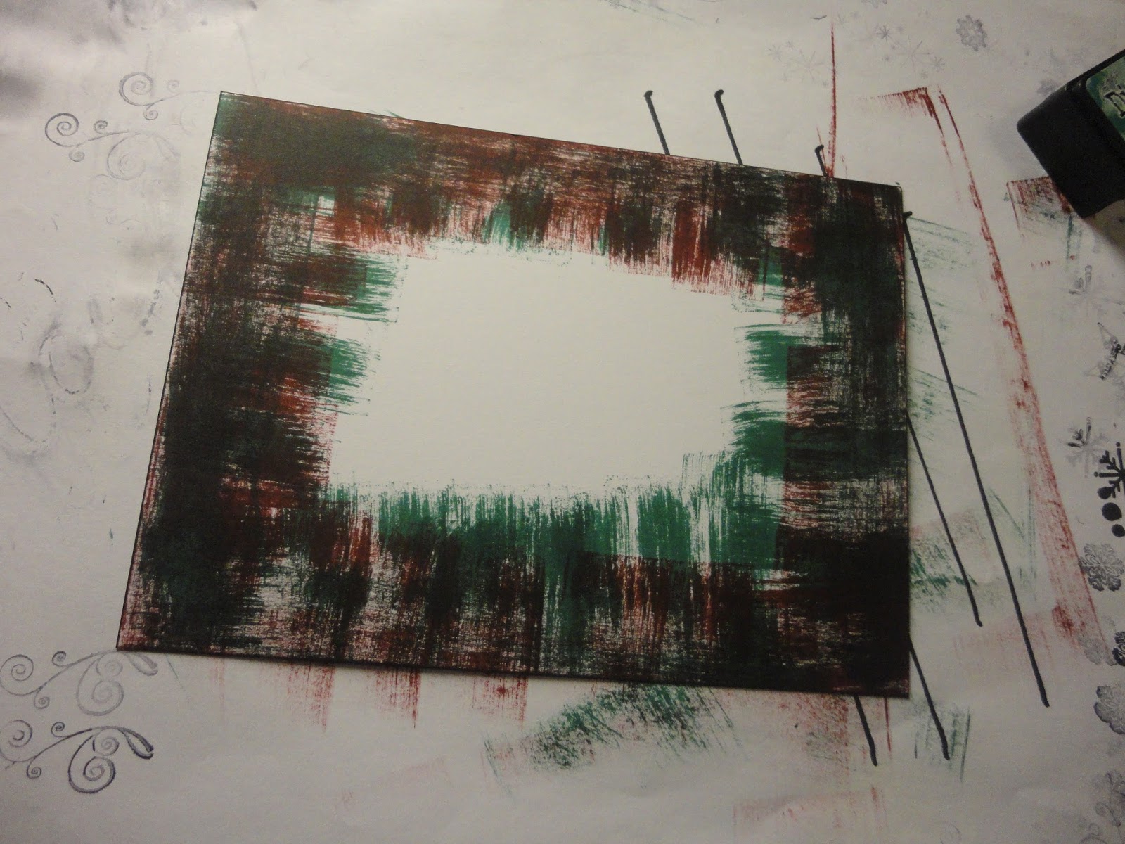
For the background I used an A4 canvas board. I started by adding grunge paste through the squares and curly stencil.
When this had dried, I painted it all with black gesso. I then started adding colour, with acrylic paint. I brushed through punchinella, and dry brushed, although as the gesso wasn't quite dry, it ended up a bit muddy. So I dried it with the heat tool (short on time!) and had another go, with lighter colours - a cream, and hey pesto green. I overdid the cream and punchinella, although the mix of the two colours was lovely. I then brought in some cherry red, and got pink where it mixed with cream. This was turning into one of those "keep going till you like it" projects.
I dry brushed cream over the curly grunge paste, which highlighted it nicely.
The squares on the bottom left needed lifting, so I added red dots, then went through the leafy swirl stencil (didn't work), then the brick stencil, which I liked, but it was too pink. So I added purple, and was finally happy!
I tried the leafy swirl stencil on the main area as well, with a make up sponge, but it didn't look right, so I ended up dabbing over with the sponge, and sweeping up from the bottom with it, with the mix of colours that had developed on my palette (a plastic box rescued from the recycling!)
They say it's about knowing when to stop. Sometimes the time to stop is when you have to go and pick your daughter up from the childminder!
The next stage is to get the mod podge out, to add the tissue words and the nautiluses. I had to be careful with the tissue, as I'd used a dye ink and didn't want it to run, but I didn't want to use an archival ink and get it all over the stencil. The tissue more or less disappears, so the words sink into the background, as I'd hoped.
After this point, I decided I needed a third nautilus (they say odd numbers look better, turns out they are right!). I dabbed green paint over the two shown here, to merge them into the background a bit more, they looked too clean and crisp.
I added the letters with 3D silicon glue, to stand out a bit. To define the edges of the canvas I ran the black archival ink pad around them.
To mount, I got an A3 canvas board. It looked a little plain, so I added a final touch with one of the pattern stamps, in opposite corners. I used black archival ink, and touched up with a permanent pen - stamping on canvas is a bit inexact!
I attached the two canvases with an adhesive sheet.
And the final thing - I put my initials on the bottom corner.
I had no real idea how this would turn out when I started. The process was a lot of fun (and isn't that the point?), and I'm pleased with the outcome.
We have a gorgeous ivy covered wall at the front of our house, which grows madly. We used branches from it in the table centrepieces for our wedding, I love ivy leaves and it was a way to include something from home, as we didn't get married locally.
I've been making use of it again for a Christmas wreath. I saw this done on TV years ago (Kirstie Allsop I think), and have been meaning to try it each year since. My prompt was this month's Berkhamsted Creative Challenge - which has a Christmas theme to help us get ready.
My ingredients are a selection of long branches cut from the wall, and a box of decorations I've had for years. I think I bought these on the post Christmas sales, for gift wrapping and things.
First step is to make the wreath - twisting the ivy strands round each other. Forming a circle is very easy, filling out the gaps and getting the leaves pointing the way I want is a bit more fiddly.
But I think it looks quite good, very verdant.
Next I add some decorations - a ribbon at the top, some baubles and poinsettia flowers around the ring. Not too much, I don't want to overwhelm the ivy, I want it to stand out rather than be the background. The Baubles are tied on with their strings, the poinsettia are wired - very handy.
Touches of red to set off the lush green ivy. Ready to hang on the front door.
Just fits below the knocker - luck rather than judgement, maybe I should have measured first!
This week's theme challenge at the 52 Christmas Card Throwdown is Old Fashioned Christmas.
I have some paper packs with lovely, vintage images, which I really like but don't fit with my usual cards. So this was a good excuse to dig them out.
I also pulled out some wooden frame embellishments, some old and some new, to, well, frame the pictures.
Hubby has been getting me some great dies from The Works (very reasonable too) so I used the foliage ones, and a Tattered Lace ivy die, to cut another design paper - it has a subtle snowflake pattern and a linen texture, so the foliage doesn't look too flat.
The red background paper contrasts nicely with the foliage and frames, so they stand out. I blended brushed corduroy distress ink around the edges. I added a strip of cream "Merry Christmas" ribbon around the card.
The final touch is the bow and stars. These were die cut from another of the vintage images, which had a glitter and gloss finish, to give a touch of sparkle and to match Santa's hat, which also has a bit of sparkle in it.
I put the card together on an A6 card base, using super sticky tape. I really don't get on with glue, but needed something more than tape runner to hold the wooden embellishments.
It's a bit of a change from my usual style (if I have one) but it's been fun to try a different look, and a bit of a mixed media approach.
I was just finishing my clean and simple cards for the 52 Christmas Card Throwdown colour challenge, when my daughter woke up. As I cuddled and settled her, I had another idea of what I could do (simply) with lime green and real red.
I say I had an idea, it's a straight copy of a card Barbara Gray did on telly, adapted to the colours and the stamps I have.
On 7x7 stencil card again, I positioned a sticky note in the centre. I stamped under one corner (using the sticky note for positioning) with a big wooden stamp of a fir branch. This was a bit of a favourite last year, I haven't used it this year so good to get it out again.
I reversed the sticky note and stamped again in the opposite corner. I used crushed olive distress ink.
With the sticky note in place, I brushed on more crushed olive with stencil brushes, between the images. When the note is removed there's a nice crisp aperture.
I stamped the "Season's Greetings" sentiment in fired brick in the middle.
Then it's just a case of trimming back, edging in the crushed olive with a distress marker, and mounting on a 7x7 card base.
Having done this, I wondered whether a red border would have been better. Only one way to find out, and it's such a quick card, it's easy to make another and try it.
Hmm, think I do prefer the green, but now have two cards I'm happy to send to friends - it is getting to that time where my stash will be put to use!
It's a busy week, with Bethany's second birthday on Friday and my mum arriving tomorrow, so I needed to get my card done early for the 52 Christmas Card Throwdown challenge.
It's a colour challenge, lime green and real red.
Hmm, not sure what I think of these colours! They would be good for a poinsettia, but I don't have a stamp or a die for that (makes a note on the wish list!). What with everything, it's a week for clean and simple, and I decide to stick to words (sort of).
I also don't have the exact colours, but again, not going to muck around so I'll make do with the nearest I have - fired brick and crushed olive distress ink and distress markers, plus barn door marker, and a red and fresh green pigment ink.
I get out the 7x7 stencil card and start playing, and end up with a range of cards. I like some more than others, and some I think are a bit too simple, I'll add something to them before using.
I think this is one of my favourites. It uses word chain stamps from Clarity, and an old rubber holly stamp, one of the first stamps I got, that I love. I stamped the words in fired brick, then went around one side of each letter with the crushed olive distress marker (the fine nib).
The border is a wide stripe of crushed olive, then a narrow stripe of red sharpie. And yes, I did test this on scrap first to make sure it worked! I cut down the card around the words, and mounted on a 6x6 card base; some are on 5x7 cards.
This is a similar card, but with the colours reversed.
And again, but portrait.
A different set of word chain stamps used here, and I had another go at a stamped drop shadow. The bird is from a Hobby Art stamp set.
A different approach here. This is a Crafters Companion stamp (the word bauble), with a Lavinia's stamp star cluster around it. Very plain, but looks pretty good in real life (in my humble opinion!)
Another take again. I used the red pigment ink here; the Ho Ho Ho stamp is not such good quality, I can't remember where I got the set, might have been a freebie, so the distress ink just beaded on it.
This is a version of the card above. This time I used my "Hope" stamp from Clarity, masking to get Ho Ho Ho, so could use the distress ink. But I used the pigment ink for the swirls.
And a final card using the pigment inks. I definitely think I'll add something to this one before using it.
So lots of playing, and a batch of cards, some more successful than others!
We're back with another sketch at the 52 Christmas Card Throwdown Challenge this week.
I love this design, it's sparked so many ideas. I have several cards half made using this, and some stash pieces from things that didn't work out, but here's the card I finished.
I started with Clarity stencil card, and stamped the wee houses along the bottom, using potting soil archival ink.
I added a mask for a large moon, and also masked the houses (the masks come with the stamps, makes it very easy).
Next I added the sky with chipped sapphire distress ink, using the brayer.
I stamped stars in the background with versa mark, hoping for a resist effect, but they didn't show through the ink.
I used a make up sponge to add ink around the moon and houses, to sharpen up the edges.
With the masks removed, there's a nice contrast.
I brushed a bit of blue across the moon, to tone down the whiteness a little bit.
I stamped a sentiment across the moon, using the Clarity word chains. First time in the potting soil archival.
I took a picture at this stage in case I mucked up the next bit.
I then used aged mahogany distress ink, second generation, for a drop shadow.
Not perfect, could have been straighter and closer to the original, but still like the effect.
I trimmed the card down, and edged with brown sharpie.
Next to add some colour to the houses. I used Faber Castell pencils. Warm yellow for the windows, and red/brown shades to fit in with the line art and words.
For the three squares down the side, I die cut three presents, using a Tattered Lace die.
I cut pieces to fit behind, and brayered ink on in red, brown and blue to coordinate with the background. I didn't like the bows on the die, so cut a different bow using a spellbinders die, and inked though the die to give a white border.
The orginal idea was to have Santa's sleigh going across the moon, which makes more sense of the presents!
This is the first version using that idea, but it was a bit too blue, and I cut it portrait for a 5x7 card base, then didn't have space for the squares. I'll find a way to use this though, maybe add sparkly snowflakes down the side.
This time, I used a 6x6 card base. I mounted the background and the presents on foam tape to raise them up, with the bows on little pads. The top one was off the top of the background, so needed two tiny pads, and a bit of super sticky tape under one of the tails to secure it.
I like the warmth that using the brown tones gives to my favourite blue. It feels much more like a traditional Christmas card.
And I have finally used my wee houses - I wanted these from launch, treated myself in the summer, but hadn't actually put them to use. They're such lovely, detailed stamps.
The fifth challenge of the month of October for the 52 Christmas Card Throwdown is pick a previous sketch. I have gone back to July 2013 for this one:
The technique I've used is based on Leonie Pujol's stencils and masks, and matching stamps. She hasn't brought out the Christmas sets yet (she admitted the other day they weren't done in time for this year - so they'll come out next June - I'll be looking out for them!) So I'm rather cheekily doing the same approach but with a Clarity stencil, and a mix of Christmas stamps.
I started by putting stick 'n' spray on the back of the stencil, letting it dry a bit, then applied it to Clarity stencil card.
Using a blending tool, I applied antique linen around the stencil.
I went though all my stamps and pulled out all the small Christmassy ones, including some swirls and embellishments.
Using archival black, I started stamping around the stencil.
I chose archival black for a crisp finish, although it doesn't wipe off the stencil. I used stazon cleaner when I'd done, and most of it came off, although it doesn't look like new! A dye ink would be better for that, but I only had distress ink, which isn't so crisp.
I gradually added stamps, building up the area around and inside the stencil.
The finer stamps work better, and I like the swirls extending the image out. It goes quickly once you get going, and is
quite fun. It would be nice to do one with mainly snowflakes. I'd also like to try doing it with versa mark and adding mica powder, but that would end up as a blue card with silver or gold, and after three blue cards already this month, I wanted to go for something different.
Once I was happy with the stamping, time to lift off the stencil.
I think Leonie's stencils are wider than this one, so give a bit more of a dramatic void, and I could use a darker colour ink, but it's still a nice contrast with the busyness of the stamping.
I added colour with pencils, and used grey around the "Noel" to emphasise it. I then trimmed back the image and edged with a black sharpie.
I made the line thicker before finally constructing the card.
I had a few goes at the tilted panel behind the topper.
I wanted to try a technique I saw on Mister Maker (a children's art show my daughter watches) using wetted tissue to stain the card.
I laid the strips over wetted card in both directions, in Christmassy colours, and stuck them down with more water. After it dried, I brushed the strips off, to reveal the stain.
Not really the tartan pattern I was expecting! I think maybe my colours were too dark, and I used different brands of tissue from my stash, which bled unevenly.
So next I tried aged mahogany and pine needles distress inks, dragging the pads directly onto the paper to give a tartan like effect.
Not great either, I think these colours are too dark again, the technique looks lovely with lighter colours.
Third time lucky (otherwise I'd have been searching through my design papers for a tartan or similar!), I blended aged mahogany around the card, then overstepped in the same ink with one of Leonie's stamps, a swirly pattern.
For the base layer, I used pine needles ink and a little star stamp from Lavinia's stamps, that I'd used on the topper.
I love the delicacy of this stamp. However, in this colour it's a bit strong for a background. I brushed more of this ink over to tone it down a bit.
I put the card together on an A5 base, using foam tape to lift up the top two layers. I then decided the topper needed a little lift, so added some gems on two corners, and tiny ones into the stamped pattern, in the centre of the snowflakes mainly.
And I took my photos.
Unfortunately, I then decided I didn't like the background, it fights with the main image too much. And my "in bed at a reasonable time" last night turned into "a late night".
I gently eased the top layers off the card (which I kept in case it works with another design - waste not want not!). And had a bit of think about what to do instead. Maybe the same in a softer colour?
In the end, I went for an embossed layer, in plain white. It's a swirly pattern, which fits better with the topper than the stars, which looked a bit spiky.
I edged the card with black sharpie first, then used a tattered lace embossing folder. It was smaller than the card, so I had to extend the pattern; there's a slight line at the overlap, although the pattern is continuous, but it's disguised by the toppers.
So here's take two.
A fair few false turns to get to this final card. But hopefully some learnings along the way.
I can't wait to play with this technique some more, it's very satisfying. The only problem will be working out where all those stamps I pulled out belong when I come to put them away!