Saturday, 22 June 2019
A snow flurry surprise
Fabiola's last challenge as June's host for the 52 Christmas Card Throwdown is:
I usually stick to flat cards for Christmas, for posting and also for ease of display amongst others for the recipient. But happy to try something different!
I have a book on pop up cards that I got from a charity shop ages ago, so I pulled it off the shelf and had a read through it in bed the other night, looking for inspiration (and instructions!).
There are some amazing designs and mechanisms, but I wanted to keep it simple for my own sanity!
I did actually do a dry run for this - and just as well as the first go I got myself in a right muddle, But it did clarify in my mind what I was doing, and the second was a lot better.
Then I was ready to tackle the real thing (albeit with a few changes to the dimensions to ensure the pop ups stayed within the card borders).
I wanted to create a snowflake flurry. I had in mind a page from a pop up Christmas book my daughter has - although that is a hugely complicated mechanism I wouldn't try to replicate.
Instead, I pulled out the snowflake swirl die from Leonie Pujol - this is fast becoming a staple - and her Snow die to match. I cut these from centura pearl card.
For the body of the pop up, I took a sheet of Sheena's stamping card, and sponged over distress oxides in shades of blue and purple. I flicked water over it, waited a bit then blotted, to give a snowy look.
It maybe looks more celestial than snowy - especially as the colours are a bit distorted in the photo, it is more blue!
I cut this to size then measured up and marked on the back for my layers, and cut and scored my lines.
Fortunately it worked!
I added a bit of stamping, heat embossed in white.
I then stuck my die cuts onto the pop out sections - I cut a few more for the top and bottom, trimming the swirl where needed for the fit.
I then realised that I needed to decorate the outside of the card as well! I didn't want it to detract from or compete with the inside, so kept it simple.
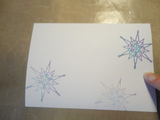
I cut another piece of the card to size, spritzed with water, then stamped snowflakes (from ClarityStamp) using the same distress oxide colours as the inside, mixing them on the stamp. I used first, second and third generation stamping. The water on the card helped it to merge and to get the third generation print.
I glued the pop out section into the card blank, to give myself wiggle time. I did one side, then once positioned, I applied glue to the other and closed the card onto it to get the right position.
The front I attached with super sticky tape, as it was warped slightly from the water.
So this is the outside - pretty but modest.
And it opens to reveal - my snow scene.
In real life there's more movement between the layers, and you can see the slight sparkle and sheen on the die cuts.
I am delighted with how well the pop out has worked, it's really square and sturdy. All that measuring was worth it!
I may be converted to pop ups - for some special people. They do take a bit of time, especially as you have to decorate the inside and outside, although I think having done this one the next would be quicker. I had another idea for a design when planning this, which may end up under the tree with hubby's name on this Christmas!
So, if you fancy having a play, do pop over to 52CCT and share your card. You have until Friday 5th July to enter - two weeks this time as there are 5 Saturdays in June, so plenty of time to experiment. Have fun!
Saturday, 8 June 2019
Such stylish swirls
Fabiola has chosen a very stylish colour combination for us to play with at the 52 Christmas Card Throwdown this week:
Kraft card isn't my favourite look for large areas, or to ink onto, but I do like it die cut, so I got out some new dies from Tonic, a Christmas alphabet, and snowflakes from Leonie Pujol.
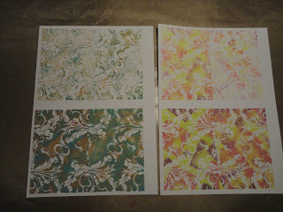
And then to the background! I used a Wow embossing stamp, every time I go through my stamp folder I think I must use it sometime, so this was the time. I didn't emboss with it though, I inked up with hickory smoke and picked raspberry oxide, spritzed with water, then stamped onto Sheena's stamping card (on the left below).
I respritzed and stamped again for a second impression (on the right below).
As the stamp is smaller than my cards, I repeated, matching up the patterns - not perfectly, but well enough.
This was a "Wow" moment, I love how this has come out! So you know I had to make some more, in different colour combinations.
But back to this week's cards.
My curly letters got a little lost on the background, so I lightly stamped onto a scrap of card in the pink and grey, spritzed to soften the colour, and die cut the central parts of the letters.
These fitted back in, then the letters and the snowflake sprays went onto the darker background.
I had cut the background to size, and blended more of the hickory smoke round the edge.
I love the delicacy of this.
The kraft inner letters are for the lighter background. Originally I was going to put them over the kraft panel, so needed them to stand out. I sponged ink on, then highligted with a white gel pen, then added a sparkle pen.
When I came to put it together, I changed my mind on the layout, but like the pretty letters anyway.
Still love that background everytime I look at it!
To join in with the challenge, visit the 52CCT page. You have until Friday 14th June to play along.
Saturday, 1 June 2019
Sketching from my stash
We are in Fabiola's capable hands for the 52 Christmas Card Throwdown this month.
As always, we start with a sketch:
After last week's experimentation, I played in my comfort zone with this one, with some favourite techniques.
I started with three backgrounds from my stash. As they were going to be covered, I didn't use the "special" ones, I chose the plainer ones that I wasn't sure what to do with.
After cutting to size, I used sticky notes to mask off areas, then added ink (distress oxides) with the petite gel plates, and a selection of stamps I'd pulled out.
This is such fun, building up layers of colour and pattern. It's nice to work with a small selection of stamps, it makes it more manageable than trying to find the "best" one from my whole collection.
For the sentiments and focal images, I used versafine black; I also ran this around the outside.
Here are two of the pieces at the end of this stage (I forgot to photograph the other one before moving on).
To finish, I used polychromos to define the edges of the areas with a drop shadow, and to colour/highlight some of the details.
This is definitely my favourite, the light, bright background I started with has made this a lovely, warm card.
I'm not sure the colours gel so well on this one, I was fighting the blue base a bit, maybe I should have stuck with cooler colours. But I do like the baubles!
This is the most sombre - with hindsight maybe a grey acrylic base wasn't the best choice! But I am rather fond of it nevertheless.
To join in with our challenge this week, head over to 52CCT. You have until Friday 7th June to play along. Enjoy your crafting!
Subscribe to:
Comments (Atom)


