The first Clarity Challenge of the year has the theme Animal Kingdom.
This is quite fortuitous, as I got the hare stencil for Christmas, in order to make a picture for my mum's birthday at the end of January. She loves hares, so I thought of her as soon as I saw it.
I wanted to make a canvas for her, as I love the texture. I tried the stencil on various sizes - I wanted the main image to be quite close in to the hare - and found that it fits beautifully onto a 6x6 canvas if you tilt it. And that this then fits onto an A4 canvas at an interesting angle.
I started with the background of the 6x6. I wanted to make it quite natural, and quite bright rather than moody. I brushed on acrylics, then added the grass with the side of an acrylic block.
I was really pleased with this, but then I added the hare, with texture paste. I coloured him/her with distress ink, and brushed ink inside the hare shape as well, but it really wasn't working for me (the photo looks a bit better than I thought it did in real life!)
The shape is too abstract for such a literal background I decided. So late one night, this happened....
Working with it and playing around, I got to this...
Which I liked, and was going to colour the hare a grey metallic to match some of the dots, then decided that it was a bit too out there for my mum, and not what I wanted.
So I gesso'd over the top in white, and went to bed!
The next day, I added the green (hey pesto is the colour - it's translucent so it needed the white underneath to be this vibrant).
I followed a similar path to the night before, but in more natural colours. I dry brushed white metallic over the background, mostly on the right, then added dots in this and burnt umber with a bit of gold mixed in.
The hare was also painted in the brown and gold mix, and I dry brushed inside the shape a little. The eyes I painted with the solid brown, to make them stand out a little. I ran a sponge with the brown and gold on around the edge to frame it.
The background was developing alongside this piece, and trying to keep up with the changes! I divided the A4 canvas into 4 areas.
They had quite different base colours, but the idea was that as I added colours they would tone in together more. I used the birch trees stencil top left, the NDC trees top right, the 2 in 1 curly strip bottom left, and the wild flowers bottom right.
I like them all individually here, but they don't hang together as wells I'd like, or with the hare (in its final incarnation!). So I added more dots, in the brown and gold, to the top right and bottom left, which were a bit stark and plain. It still needed softening - it is the background, so I didn't want it fighting with the main image. So out came the punchinella. It really is a life saving piece of kit! I sponged the brown/gold and the metallic white through in patches. I particularly like the effect over the wildflowers, I'll use this combo again for a background.
I think this is part way through the process of adding it. The metallic white doesn't show well unless it catches the light.
I edged this canvas in the same way as the smaller one.
The final touch was to define the vertical lines between the sections. I tried adding a row of the dots, but they went really wonky and uneven, and looked awful! For plan B I painted a scrap strip of stencil card with the brown/gold mix, then die cut it. I think the die is meant to be rolled to make a flower, but it fitted this purpose very well. I attached it with PVA, and wrapped it around the back of the canvas.
The 6x6 went onto the A4 with a double sided adhesive sheet, then I decided it needed a further frame, as it's quite busy, so it went onto an A3 canvas, with another adhesive sheet.
This was one of those projects that I really wasn't sure where it was going when I started. Although even if I had, the plan derailed pretty quickly!
It was a lot of fun playing, experimenting, and finding other routes when one didn't work. Painting right over something you've been working on for a while is a bit scary, but liberating at the same time. You always get to start again!
If I did this again I might change the background a bit, but I'm really happy with how the hare has turned out. I got my natural colours, and it's bright and sunny, but is abstract enough to suit the style of the stencil design.
Here's my second Christmas card of the year, for the Christmas Card Throwdown.
We have a colour theme this time:
I really like the colour challenges. This combination didn't spark anything straight away for me, so I went to my gelli plate to have a play.
I started by trying a three layer print.
This is the first layer - brown acrylic spread very thin, and blotted through the brick stencil from Clarity.
Next I added aqua and quickly pressed the Clarity leafy swirl stencil into it, again blotting with punchinella. I waited for the exposed paint to dry, then whipped the stencil off (and into soapy water) and blotted with copier paper, to lift off the still-wet paint from under the stencil.
I then spread cream acrylic over the plate, laid the card over, rubbed it in and pulled a print.
And as you can see, this isn't as easy as Barbara Gray makes it look on TV! There are white patches where the paint has stayed on the plate (although it's not as bad as the photo looks, as the camera has bleached it out a bit).
Second go, I used a bit more paint, and this one isn't bad, but still have some bald patches.
Third time round I decide to simplify, and skip the first, brown layer. This works quite well, I have a full print (the bald bits on this photo are just from the camera), although i don't like the colour as much.
I have a a last go at this version, and use more paint again. After the first stage, it's looking good!
Not so much after the second stage! I think I used far too much cream paint, and the card got soggy and came apart, sticking to the gel plate. Ah well, live and learn.
Next time I try something different. This uses a brown layer and the brick stencil, lifted off with cream paint. Interesting, not nearly as pretty! But I love the waste.
This was from blotting the first layer, and is just on copier paper, but I will definitely use this for something.
The brown paint seems to be behaving better, so I then tried it with the leafy swirl stencil.
I really like this! And following the last one, I had brayered some cream paint onto card and used that to blot the first layer, instead of copier paper.
This is the result. Not bad either, although in real life it's a bit blurred and looks out of focus, so makes your eyes go a bit funny. So have to choose carefully how to use it!
After a morning's play, this is the selection I have to choose from. It's the brown leafy swirl, the rest go into the stash. I cut it down to size for a 5x7 card base, and edged with a brown sharpie.
I brayered cream paint onto a scrap piece of card. Using an alphabet stamp set from a charity shop, and potting soil archival ink, I stamped out the words I wanted, then cut them up with a craft knife.
I also brayered the aqua onto a larger scrap, to use for the frame and for some embellishments. I die cut a reindeer and some stars from this and the waste of the swirly background.
The circle is part of a die set from The Works. It's cut in 4 to make corners to use for the frame. This is a technique I saw on a card in I think the December challenge, which is a great way to make a frame as well as using a lot less card than the usual matting and layering.
I also used the aqua card to mount the words.
The last element is some cream crocheted lace, which I think I got from Tiger over the summer.
Then it is just a case of construction. The frame was made with strips of the aqua card, taped to the back of the main background, with the corners I'd made to cover up the joins. I used the aqua reindeer as a drop shadow to help the reindeer stand out, and the same with the larger stars. (The large brown stars have gone onto the insert.) I used foam pads to lift all the elements and give dimension.
The brown and cream are so soft and pretty in this card, and the little pops of aqua lift it nicely. Not a combination I'd have come up with, but glad I got to play with it.
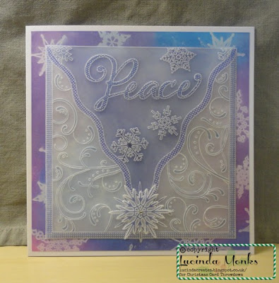
It's time for my first card as a member of the Christmas Card Throwdown design team!
We have a sketch challenge to kick us off for 2017.
I wanted to do something a bit special. I haven't used groovi for a challenge card before, so it was time for a bit of parchment.
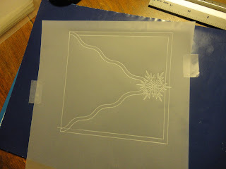
I started with a snowflake for the star part of the sketch. I think snowflakes must be my most used Christmas image! These Clarity ones are so pretty, I use the stamps a lot too.
Next I add the frame. Straight lines for the outside, and wavy for the triangle - I see this as an envelope flap, although with hindsight I think a border along the top would have looked better. Doing this after the snowflake means the snowflake can sit over the frame.
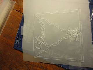
Time to start filling in the spaces I've made. A word for the focal point - this is all worked from the back, so this is the first photo showing the front of the piece.
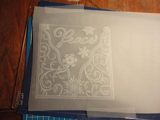
And now the really fun bit - filling in patterns. I used this floral groovi plate for the outside, but by just picking up the swirls and dots, and not embossing the flowers and leaves, it makes a more Christmassy background. It's so easy to just pick out the parts I want to use, and ignore the rest.
For the "envelope flap" I used smaller snowflakes around the word.
Finally, to make the word and borders stand out, I used the piercing grids to emboss a dotty pattern. I did all the dots, rather then trying for a fancy pattern in the border!
With all the embossing done, I add some colour. I used faber castell polychrome pencils, and then when I wanted more colours, distress markers as well.
This is what it looks like from the back - the colours are a lot more vibrant (you colour on the back so see them through the parchment on the front). It may not show well in the photo, but this also means you don't have to be too accurate - it's very forgiving if you go onto the lines.
To make the triangle stand out more, I brushed distress ink over the back. This is salty ocean and chipped sapphire.
For the background, I used the matching snowflake stamps from Clarity. I stamped in versa mark onto coated card, then blended distress ink over the top, giving a resist. The colours are salty ocean, chipped sapphire, picked raspberry and dusty concord.
To construct, I cut the parchment back to the border with a knife, cutting round the snowflake that peeked over the bottom. I also cut the background to fit a 7x7 card (keeping the rest for another day). I attached the parchment with super sticky tape under the coloured areas, then the background with a tape pen.
Edit: I forgot to say, I attached a plain piece of parchment behind the decorated piece, to increase the opacity so the background didn't overwhelm the design.
For a final touch, I embossed the large snowflake onto an off cut of parchment and coloured it to match the one on the card. I then pierced around the outside, and picot cut it out. I attached it above the base one, but offset, with a clear foam pad so it's raised a little. A tiny gem in the middle finishes it off.
I didn't do that much groovi work last year. I think I got caught up in the white work, which is beautiful but time consuming, so not always practical when you need a last minute card.
But as this shows, you can make a beautiful piece without whitework, and I love combining parchment and other techniques. So I'm going to try to play with my groovi stash more this year - watch this space!


