Pages

Sunday, 26 February 2017

Better late than never!


It's the second week of our Sunburst/Starburst Challenge at the Christmas Card Throwdown.


I mentioned last week that I wanted to try a different technique that generated less waste. I got the idea from this youtube video. I started these on Wednesday, but a continuing horrible cold and Bethany being under the weather mean I've only just got finished!

This approach relies more on measuring and planning. I used a base of 16.9cm by 11.8cm, to go on a 5x7 card base, then a template of 14.9cm by 9.8cm for the burst. I cut four papers to size for the burst, as well as a copier paper template. On the template, pick a centre point, then draw 12 lines out from this, to create your burst.

I did do a dry run of this with just copier paper, and found that you need to have the same number of lines ending on each side for the spacing to work - you can see where I've altered the pattern below.


Put the papers in the order you want to use them, then put the template on top and clip together.


And cut along your lines. I used scissors, I'm not good with a knife freehand, and the clips make a ruler difficult to use.


When you have your 12 shapes, lay them out and remove the clips. Discard the template. Then go round the circle, leaving the first section as it is, then on the next moving one piece from the top to the bottom of the pile, two pieces on the  next, and three on the next. Repeat all round the circle. This means that you can easily make your four bursts without ending up with the same pattern next to itself.


I cut my base pieces from 4 different red papers. On the first, I took the top piece from each pile and glued it onto place, using a glue pen. I found it easiest to start with the corner pieces, then fit the others in-between. For this style, I left a gap between the pieces, rather than butting them up against each other like last week.

Then repeat with the next base and the next layer from the piles.


So here are my four burst backgrounds, with no waste!

For toppers, I went super simple! I had a set of pictures that I'd cut up from a design paper last year. I chose four, and mounted them on the off cuts from cutting the bases. I edged each with aged mahogany distress ink, and with Crafters Companion clear overlay sparkle pen. This is a new purchase, I'm very pleased with it!

The backgrounds went onto the card bases using a tape pen, and I used foam pads for the toppers.


A simple way to make four variations of a card, quickly and easily.


To join in with the challenge, visit the Christmas Card Throwdown, you have until this Friday, 3rd March, midnight GMT.


Tuesday, 21 February 2017

What a difference a year makes


Having posted my birthday card for Susan yesterday, I realised I never blogged the card I made her last year.

This was one of the first times I used a piece of "waste", from cleaning my blending mat. When I have left over ink on there, I spritz it with water and press paper or card into it, which gives a lovely speckled texture.

I don't remember which project this was the clean up from, but I love the brightness of the orange with the dark red.

It's a very simple card, I cut a section of the waste paper for the background, then another for the topper. I think I added more of the spiced marmalade ink to the topper, for balance.
I stamped my Clarity Daydreamer onto the topper, in black stazon from memory.

I cut a white mount for the topper, and mirrored this with the border of the card base around the background. (I think this was an A5 card.) I edged all the pieces with a black sharpie to define them, including the card base. I don't usually do that, but it does look quite striking now I look back!

The finally touch is a black die cut of the words Happy Birthday.


I had originally planned to have the topper at a jaunty angle, but preferred the symmetrical look.

It's lovely to revisit this card a year on, I still love the bright, fresh feel of it.


Monday, 20 February 2017

Happy Birthday Gorgeous

(Apologies for the poor photo quality, we still haven't replaced the bulbs in the kitchen!)

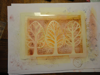
Today, I've been playing with two new additions to my craft cupboard. A beautiful tree stencil, which was the January Clarity design club gift, and It Is Written stamps from BoBunny, which were part of my Valentine's present from hubby.

I started with Clarity stencil card, cut to size for a 5x7 card base (this one is going in the post so didn't want to be too extravagant). To give some base colour, I added antique linen distress ink with a stencil brush, as I didn't want the stark white.

I masked a border on three sides with tape, then taped the stencil over the top, which masked the fourth side, and obviously the tree shapes.


To add more vibrant colour, I brushed on aged mahogany towards the outside, with brushed corduroy at the edge, then ripe persimmon more centrally, and a burst of wild honey in the centre. This last is a new ink pad and more juicy, so was a little more intense than planned. But not an issue, I intend to build up the colour anyway.


Time for the new stamps, which have script and music on them, as well as a large music stamp I've had for ages.

Using the same colours, I over stamped roughly in different areas with the different patterns. I didn't use a block, so I could get in between the stencil better. The stamping doesn't have to be perfect for this effect.


I wiped the ink off the stencil onto the card with a sponge, to intensify the colour and really define the edges. I tried using my current favourite distress stamps from Sheena, but they're rubber and stiffer, so didn't get in close to the stencil as well. I added more colour at the edge with the sponge before removing the stencil.


Lovely crisp image for the trees, and I love the flash of orange in the centre.

I used a Faber Castell polychromo pencil to add shadow around the trees, for more definition. I also dragged the aged mahogany pad around the card to edge it.

For the words I used scraps of stencil card, which I had also brushed with antique linen. I have an alphabet stamp set I think of as the circus one, with a mixture of quite ornate fonts. I used this to stamp the separate words Happy Birthday Susan Gorgeous Friend, in potting soil archival ink and claret stazon.


I cut them out (by eye with scissors, I didn't want them perfectly straight or square). To liven them up, I used the stamps again, and a couple of the distress ones. I used aged mahogany and brushed corduroy, but found that a splash of the wild honey looked great. I also edged them with the two darker colours for definition.


I really like how these have come out!

To help them stand out from the background (I don't want to use foam due to postage) I mounted them on more scrap card brushed with the antique linen, and hand cut them with a narrow border. I brushed the edges to make them a little darker.

I then mounted these onto the background with a tape pen, and attached the background to the card base in the same way.

I used the stamps and the same colours to decorate the insert and the envelope.


Spot the "deliberate" mistake? Out of habit I did the insert in portrait, it should have been landscape for a tent card. Oh well, I can live with that.


I love this stencil, it's so simple and stylish. It works well with the busy, shabby chic background. I like the amount of texture there is in what is by necessity actually a very flat card.


PS I just noticed that this is my hundredth blog post - that doesn't seem possible! I guess time, and posts, fly by when you're having fun x


Saturday, 18 February 2017

Thank You Marianne


Last July, the woman who'd taught Bethany and I baby signing for over a year and a half, had her last class. Some in the group had been with her for years! So we had a collection, and I volunteered to make a card for everyone to sign. (It's taken me a while to get round to blogging it!)

As it needed to be quite large, I used an 8x8 card blank, and 7x7 stencil card for the main image, without trimming it.

I attached the brick wall stencil from Clarity with masking tape, and brushed over a light layer of distress ink, peacock feather round the outside, crushed olive inside this, leaving the centre light. I then added the left swirl stencil over the top, and added more ink, to give a more subtle swirl pattern. I used the same inks, and added salty ocean to deepen the colour.


With the stencils removed, this is the result.


Very pretty I think!

Next step is to add the message in the middle. I used the word chains for this - I don't have a Thank You, so had to mask letters from other words to create this, and the name. I used black archival ink.


I don't have a K in any of the words, so used the R from Remember, with the top masked off. I neatened up the edge with a permanent pen, and also the i which didn't stamp completely.

Next to create a frame and cover the white strip round the outside of the card.

I used the wee flowers and foliage stamps from Clarity, and (mostly) second generation distress ink, peacock feather and crushed olive again. 


I used the leafy stamps above, like tree branches, and the more grassy ones below. I used the full length, coming right into the picture.

I then repeated with black archival ink, stamping off the page to give a black frame at the outside of the card.


I like this effect, they're such useful stamps.

To mount the card, I edged this with a black sharpie. I cut a larger mount and edged this too.


I quite like the black and white, but decided colour would work better, so blended the peacock feather round the mount card.


I also decorated the envelope, using the same stamps and colours.


I usually forget to do this until after I've put everything away!


I think there's a nice balance in this card - the colours are bright and fresh, but not too pretty, and the flowers and swirl are offset by the brick pattern. At this angle you really get a sense of dimension.


I liked the design enough to make some variations over the next few months.


This was a 6x6 card so the border was more restrained, with a cooler colour choice, in horizontal bands rather than circles.


I used a circles stencil, rather than the leafy swirl for this version, and bright reds and oranges.


I swapped out the foliage stamps for some funky circle patterns.


While not super quick to do, this is a great go-to design for birthday cards. The colours and patterns can be swapped to suit the recipient, and of course the name added - what's the point of handmade birthday cards if you can't personalise them?

Starburst


It's our first technique challenge of the year at the Christmas Card Throwdown.


I had to go and look this one up and check with my design team colleagues - not one I'd heard of before. But having watched a few youtube videos (this one in particular inspired this card) and had a play, I'm completely won over. It looks great, and is a good way to use up design papers.

So, I started by going through my stash to find some coordinating designs. It's a little disconcerting, as there are papers that I have no recollection of buying! I came up with a selection of grey-green papers. I also ran some cream pearlescent card through a few embossing folders, to add into the mix.


Once I had my selection, I cut strips roughly 13cm by 5cm, then cut them diagonally to make triangles.


I went for the holly embossed pattern for this card.

I cut a piece of scrap paper to size (16.4cm by 11.3cm, to fit on a 5x7 card base) and covered it with thin adhesive backing. You can use glue, but I had this and I thought it might be neater and less messy.

Then it's a case of positioning the triangles around a central point. It goes really quickly.


Even at this stage I think it looks good! I trimmed off the excess, and cut a piece from it to fill the gap.


There is a lot of waste with this, although I've kept all the offcuts. For next week I'm hoping to try a different approach that avoids this - if it works!

So that's the starburst done. It's such a pleasing effect, and could be the base for so many other techniques and styles.

For now, as our whole household has been struck down with a horrible lurgy cold, simple is the name of the game.

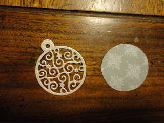
I cut a bauble die from the cream pearl card, and a backing piece from one of the patterned papers.


This will go over the centre of my burst, to hide the slight unevenness.

For a sentiment, I used a Clarity stamp. In the style I wanted my usual "Merry Christmas" is part of a larger stamp so needs masking, so I went with the stand alone "Christmas Greetings". I used watering can archival ink on the pearl card, and cut it into a banner.


I gave it a bit of a wave.

I cut some turquoise card as a mount, and attached with tape pen. For the bauble I used a zig glue pen to attached the die cut to the backing, them foam pads to lift it from the card. The sentiment then tucked under this, using glue dots to hold it in shape.


I so enjoyed making this, it's great to add such a lovely new technique to my repertoire.


If you would like to join in with the challenge, head over to the Christmas Card Throwdown. You have until Friday 3rd March to try this stunning technique.

Wednesday, 15 February 2017

Vintage Valentine


After a couple of weeks of quite subtle Christmas cards, I had fun with a more grungy, mixed media style card for Valentine's. This is for hubby, and I'll submit it to the Berkhamsted Creative Challenge, where the month's theme is "Love".


Hubby bought me a heart stamp and die set from The Works a while ago, so this seemed like the perfect opportunity to try them out. I stamped onto kraft card in archival black, then cut out with the die.


I'm not a big one for hearts, but these are quite funky, and not too soppy.

I stamped the words "i love you" in the big heart, using an alphabet set from Berkhamsted Arts and Crafts, then as it was off centre stamped a flower from the heart set in the gap. I used another stamp from the heart set in the small heart.


I blended worn lipstick distress ink round the edges, and used the same colour distress marker on the letters to make then stand out a little.

For the background, I started with a large music stamp I've had for ages. I stamped onto white Clarity stencil card in black archival, then cut to size for a 5x7 card blank. As the stamp was shorter than the trimmed card, I extended it by lining up and stamping again top and bottom.


Then the fun bit, ageing and funking up this base. I got a bit carried away and didn't take any progress photos!

I started by brushing antique linen distress ink over the whole sheet, then vintage photos around the edges. I then used a set of Sheena Douglas distress stamps to add texture around the edge, and fill the gaps beside the music. I've had these stamps for ages, I just love them, but have only just started to really use them. The "barrier" of cutting them out of the rubber sheet and spraying the back with repositionable glue proved too much! So lazy really! Hopefully now I've cut them I'll be using them more.

I also used a set with clocks and cogs - I'm not sure where this came from, possibly Berkhamsted Arts and Crafts as well. I used vintage photo, first and second generation.


I also ran the ink pad around the edge to define it.

Time to plan how to put the parts together. Firstly I stamped and die cut two more small hearts, stamped in the centre and edged in the pink.


I wanted to wrap ribbon or twine around the background, but they all looked too bulky. So I used sewing thread instead, two different browns, wrapped several times. It's much more subtle, but does give a vertical axis.

I also added more stamping on the right, for balance, with some in second generation worn lipstick, to lift the colour.

To mount, I cut a piece of kraft card to size, and blended worn lipstick around the edge, then ran the ink pad round the edge. The pink over the brown of the card gives a lovely shade.

I attached the layers with a tape pen, then used 3D glue for the hearts to lift them and so the threads weren't flattened too much.

I also made an insert to match, with the same three stamp sets. The sentiment says "be my valentine". I used tattered rose ink instead of worn lipstick, to give a more subtle look on the white.


I also decorated the envelope in the same way, although didn't get a non-blurry photo of that. It's so much fun building up the pattern, there's no pressure as you can go over the top and fill any gaps.


I'm really happy with the outcome. I like the blend of colours, a pink that isn't too pink, and the overall shabby vintage feel.