 |
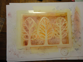
| (Apologies for the poor photo quality, we still haven't replaced the bulbs in the kitchen!) |
Today, I've been playing with two new additions to my craft cupboard. A beautiful tree stencil, which was the January Clarity design club gift, and It Is Written stamps from BoBunny, which were part of my Valentine's present from hubby.
I started with Clarity stencil card, cut to size for a 5x7 card base (this one is going in the post so didn't want to be too extravagant). To give some base colour, I added antique linen distress ink with a stencil brush, as I didn't want the stark white.
I masked a border on three sides with tape, then taped the stencil over the top, which masked the fourth side, and obviously the tree shapes.
To add more vibrant colour, I brushed on aged mahogany towards the outside, with brushed corduroy at the edge, then ripe persimmon more centrally, and a burst of wild honey in the centre. This last is a new ink pad and more juicy, so was a little more intense than planned. But not an issue, I intend to build up the colour anyway.
Time for the new stamps, which have script and music on them, as well as a large music stamp I've had for ages.
Using the same colours, I over stamped roughly in different areas with the different patterns. I didn't use a block, so I could get in between the stencil better. The stamping doesn't have to be perfect for this effect.
I wiped the ink off the stencil onto the card with a sponge, to intensify the colour and really define the edges. I tried using my current favourite distress stamps from Sheena, but they're rubber and stiffer, so didn't get in close to the stencil as well. I added more colour at the edge with the sponge before removing the stencil.
Lovely crisp image for the trees, and I love the flash of orange in the centre.
I used a Faber Castell polychromo pencil to add shadow around the trees, for more definition. I also dragged the aged mahogany pad around the card to edge it.
For the words I used scraps of stencil card, which I had also brushed with antique linen. I have an alphabet stamp set I think of as the circus one, with a mixture of quite ornate fonts. I used this to stamp the separate words Happy Birthday Susan Gorgeous Friend, in potting soil archival ink and claret stazon.
I cut them out (by eye with scissors, I didn't want them perfectly straight or square). To liven them up, I used the stamps again, and a couple of the distress ones. I used aged mahogany and brushed corduroy, but found that a splash of the wild honey looked great. I also edged them with the two darker colours for definition.
I really like how these have come out!
To help them stand out from the background (I don't want to use foam due to postage) I mounted them on more scrap card brushed with the antique linen, and hand cut them with a narrow border. I brushed the edges to make them a little darker.
I then mounted these onto the background with a tape pen, and attached the background to the card base in the same way.
I used the stamps and the same colours to decorate the insert and the envelope.
Spot the "deliberate" mistake? Out of habit I did the insert in portrait, it should have been landscape for a tent card. Oh well, I can live with that.
I love this stencil, it's so simple and stylish. It works well with the busy, shabby chic background. I like the amount of texture there is in what is by necessity actually a very flat card.
PS I just noticed that this is my hundredth blog post - that doesn't seem possible! I guess time, and posts, fly by when you're having fun x


No comments:
Post a Comment
Thank you for taking the time to leave a comment. I really appreciate hearing from you, and try to respond to every one.
Lucinda