Wednesday, 30 November 2016
Blast from the Past - Clarity Challenge November 2016
It's the last day of the month, so obviously I've been doing my Clarity Challenge entry!
The theme is "Blast from the past". This has been used as a Clarity stamp you've had for a long time, or a challenge theme for the past. I've tried to cover it all ways!
I haven't been collecting Clarity products for that long, but the first stamps I bought were a selection of New Design Club back issues. One was the nautilus, which was issue 7, so I reckon must be quite old! So I've used that.
The first stencils I got were the leafy swirl, abstract squares and flared frame, so I've used the first two. I've also got a wheelie stencil, which I think goes back a bit, so I've used that, as well as the brick work and the curly 2 in 1.
In terms of a past challenge, well, Challenge 1 was "Anything goes", but that seems a bit like cheating, so how about Challenge 15 from May 2014, "It's all about the words"?
I've just started reading and working through Melissa Dinwiddie's book, The Creative Sandbox Way. I've followed Melissa for a while, I love her art, as well as her approach. The book has prompted lots of thinking and conversations about art vs craft, which has led to this piece.
I have been raiding my stash of backgrounds recently, and have used a lot of them in this (more blasts from the past!). I have a lot of gelli prints using the leafy swirl stencil, some which tore and can't be used as a whole.
I dug these out for my "ART" letters. I remember being so gutted when the red one tore, it looked beautiful through the plate.
I printed out the three letters in very bold, and cut them out as templates, then drew round them on the prints and cut out.
I roughed up the edges with a craft blade, then mounted them on cream zeta hammered card, and cut round with a border.
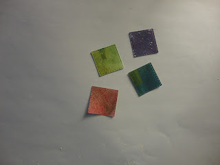
For the "CRAFT" letters, I pulled out some scraps, from mopping up ink and cleaning the brayer. I cut squares out with a die (using my amazingly useful nested squares again!)
The letters were then stamped with different colours of archival ink. I used the initial letters from word chain words, masking the rest of the word. One day I'll get the alphabet set, but in the meantime I'm getting quite good at this!
Before I mounted them, I added vintage photo distress ink to the edge of the ART letters, to tone them down.
More words for the background, using the wheelie stencil. I inked through the stencil onto white tissue, using distress inks and a blending tool.
All words that resonate with the creative process, whether it's art or craft!
The other element to go on is the nautilus stamps, onto another scrap from cleaning the brayer. I used black archival as it was acrylic paint. (I didn't get photos of these !)
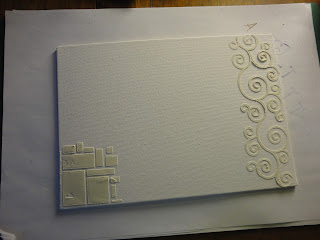
For the background I used an A4 canvas board. I started by adding grunge paste through the squares and curly stencil.
When this had dried, I painted it all with black gesso. I then started adding colour, with acrylic paint. I brushed through punchinella, and dry brushed, although as the gesso wasn't quite dry, it ended up a bit muddy. So I dried it with the heat tool (short on time!) and had another go, with lighter colours - a cream, and hey pesto green. I overdid the cream and punchinella, although the mix of the two colours was lovely. I then brought in some cherry red, and got pink where it mixed with cream. This was turning into one of those "keep going till you like it" projects.
I dry brushed cream over the curly grunge paste, which highlighted it nicely.
The squares on the bottom left needed lifting, so I added red dots, then went through the leafy swirl stencil (didn't work), then the brick stencil, which I liked, but it was too pink. So I added purple, and was finally happy!
I tried the leafy swirl stencil on the main area as well, with a make up sponge, but it didn't look right, so I ended up dabbing over with the sponge, and sweeping up from the bottom with it, with the mix of colours that had developed on my palette (a plastic box rescued from the recycling!)
They say it's about knowing when to stop. Sometimes the time to stop is when you have to go and pick your daughter up from the childminder!
The next stage is to get the mod podge out, to add the tissue words and the nautiluses. I had to be careful with the tissue, as I'd used a dye ink and didn't want it to run, but I didn't want to use an archival ink and get it all over the stencil. The tissue more or less disappears, so the words sink into the background, as I'd hoped.
After this point, I decided I needed a third nautilus (they say odd numbers look better, turns out they are right!). I dabbed green paint over the two shown here, to merge them into the background a bit more, they looked too clean and crisp.
I added the letters with 3D silicon glue, to stand out a bit. To define the edges of the canvas I ran the black archival ink pad around them.
To mount, I got an A3 canvas board. It looked a little plain, so I added a final touch with one of the pattern stamps, in opposite corners. I used black archival ink, and touched up with a permanent pen - stamping on canvas is a bit inexact!
I attached the two canvases with an adhesive sheet.
And the final thing - I put my initials on the bottom corner.
I had no real idea how this would turn out when I started. The process was a lot of fun (and isn't that the point?), and I'm pleased with the outcome.
Subscribe to:
Post Comments (Atom)


Lucinda - this is, indeed, a work of art! Such a sympathetic interpretation of this month's theme. Many thanks for continuing to share your work and best wishes in the challenge.
ReplyDeleteShelagh Clarity Challenge DT. ;~}
Thank you Shelagh, for your very lovely words. I loved making this, even with the ups and downs, it still felt like it flowed out into what it was meant to be!
DeleteDifferent piece of work but effective good luck in the clarity challenge x
ReplyDeleteThank you. I like being a little different!
DeleteHi Lucinda - what an great explanation of how you made your delightful and relevant canvas. Thanks for joining the Clarity challenge again this month. Good luck! x
ReplyDeleteThank you - it was you who got me over the hump and daring to do canvases!
DeleteGreat artwork Lucinda - Love the way it developed as you went along. I think it's great not to have the finished design already in your mind as that often leads to disappointment for me if it's not how I imagined it would look!
ReplyDeleteThank you for entering the November Challenge, and good luck in the draw x
Thank you. I have to say this was a lot of fun to do, trying different things until something pleased me. It's a lot easier to do on canvas that card. At one point I did think maybe I'd have to gesso the lot and start again, it didn't come to that but it's a nice safety net to have, makes it easier to just go for it!
DeleteWow! This is absolutely fantastic! I really appreciate you sharing all the photos of your work in progress. Looks wonderful! xx
ReplyDeleteThank you Deborah. I didn't take photos of when the canvas was going all mucky, so not quite a completely candid account of the journey! But I was in the flow a bit, and it came good quickly.
DeleteThis is just so creative I love the originality of it all - good luck
ReplyDeleteThank you so much Charlotte, that's very kind of you to say.
Delete