Pages

Saturday, 20 January 2018

Fairy Christmas


I've lost momentum on the blog posts over the last few days, but I'm back with our new 52 Christmas Card Throwdown challenge. Our first theme challenge of the year is "Fairies".


Luckily, I have a Lavinia stamp I got as part of my bargain dash last Autumn, which is perfect for this challenge.

The design of this card is copied from a card Barbara Gray demo'ed on TV recently. She used her design papers, I decided to make my own backgrounds.

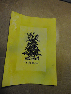
I used distress oxides to make a random pattern. I wanted it quite pale. This first was purple and blue - wilted violet, faded jeans and broken china.


The next one was yellow and green - fossilised amber, twisted citron and cracked pistachio.


This one was quite uniform to start with, so I splattered with water and dabbed off for some faux bleaching, and spritzed with distress reindeers in green shades. It's still not perfect, but I really wanted to use these colours so pressed on.

Having cut the backgrounds to size, I then stamped my fairy image, using memento black ink, and the stamp platform.


I added different sentiments to each, in the same black ink.


Then the step I took from Barbara Gray. I cut a sticky note to 7 x 11 cm and positioned it over the centre of the cards, to cover the image and sentiment. I then brushed distress ink out from the sticky note. I used crushed olive for the yellow card, and for the purple one dusty concord followed by weathered wood.


This created a frame around the image.

I decided they did need something extra, so got out a small star stamp from Lavinia. I replaced the sticky note, and stamped around the frame - in silver pigment ink on the yellow one, and dusty concord on the purple one.

Masking the frame with tape, I grounded the trees, using torn paper and the brushes, without adding more ink so it was quite subtle.


To finish, I edged by dragging the ink pad round the edge - purple/black, and mounted on 5x7 card blanks.


Two more cards for the stash, and these are definitely post friendly.


To join in with our challenge and create your own Fairy themed card, pop over to the 52 Christmas Card Throwdown, where you'll see all the great inspiration from my lovely design team colleagues.


The challenge closes at midnight GMT (7pm EDT) on Friday 26th January.


Monday, 15 January 2018

Horse whimsy


This horse stencil was one of the club member's stencils from  Clarity. I don't think it's one I'll get much use from (which is rare!) but our family in Somerset are horse mad, so it was perfect for my husband's aunt's birthday.

I started with stencil card, and blended a pale layer of green and blue distress ink over the whole thing.


I then placed the stencil over and pressed versamark through the aperture. I added clear embossing powder and heated to melt.


My versamark was a bit stained with blue, so the colour changed a little. I now have one I keep clean and just use for clear embossing - I do try to learn lessons!

I stamped a script stamp, also in versamark, and clear embossed this too.


I then added more ink, with the embossing acting as a resist. I darkened the green and blue, and added some of the script in blue as well.


With hindsight, I think I'd add more detail to the background before heat embossing, so the horse has more interest.

I watered down some silver paint and splattered it over the card. I also used it to tone down the bottom right corner, which I wasn't happy with.


I coloured a scrap of card with blue, and die cut the sentiment.


 I attached it to that problematic bottom right corner!

I edged in the green, then cut a mount and lightly coloured that with the blue to give a narrow frame, before adding to a 5x7 card blank.


I love the whimsical effect the blended colours and silver sparkles create, it has a lovely ethereal feel.


Sunday, 14 January 2018

Favourite techniques 2


I promised yesterday to share the card I made with the brusho Christmas tree.


This was the starting point; I'd spritzed water through the Clarity Christmas Tree stencil, then removed it and added brilliant red and dark brown brushos. Once dry, I brushed away the dry powder.

I thought about cutting this out, but decided to work onto the background instead. The stencil comes with the inner section as well as the aperture. So I positioned this over the tree, and stamped the words Merry Christmas (Clarity word chain stamps) across the background with antique linen, fired brick and vintage photo distress oxides.


With the mask in place over the tree again, I spritzed with water to activate the oxides. There was also some brusho powder on the card, which reacted as well to give a blush. So far so good. But the oxides hadn't done much, so I decided to add more water. And of course, the mask was only a superficial barrier, so I wet the brushos in the tree and they bled!


A bit of a mess! But I liked the effect, so didn't want to give up on it.

I placed the tree mask back on (once dried) and used a sponge to add antique linen around the mask to redefine the edges of the tree. I used vintage photo a little at the bottom too. There wasn't a mask for the star, so I cut one from card and did the same.

This improved things somewhat. I used red and brown polychromo pencils within the tree branches to further define them.

As a final step, I used a narrow white gel pen around the tree to give a clear edge.

I then trimmed the card back, and blended vintage photo around the edge. I mounted on a 5x7 card blank.


This is not my most polished card, there is a lot I would do differently next time! But I can't get away from the fact that I really like the techniques and effects both on the tree and the background. So I have a certain fondness for it.


If you would like to experiment yourself with our current colour challenge on the 52 Christmas Card Throwdown, "brown, red and cream", visit us on our blog page. You have until Friday 19th January to enter.


Saturday, 13 January 2018

Favourite techniques


Our second challenge of the year is here at the 52 Christmas Card Throwdown. This week we'd like you to play with colours - brown, red and cream.


I had a lot of fun with this card, but as I didn't really have a plan and was experimenting a lot, it took a while to get to the final result. So instead of blogging now, I'm off to bed, and I'll tell the journey tomorrow!

-------------------------------------------

I'm back!


I had a plan for a layered, collage type card for this challenge, but then I saw a video on using brushos with stencils, and I had to try it! I've tried brushos through stencils before and it never worked very well, so I was so excited to see how you're meant to do it!

I started with the Clarity framework squares stencil (all on cream watercolour card). I spritzed water through the stencil, then removed it and sprinkled on the brilliant red and dark brown brushos.


I then VERY carefully put it aside to dry thoroughly.


Next was a lattice stencil, from That Special Touch. I love this one!

I tried a flower stencil from Clarity, masking the flowers I didn't want to use, and the edges.


It came out beautifully.


I decided to add a bit more brown.


Then it was a case of extreme patience while they sat on the fish tank drying without being touched!

The next day, I carefully took each one, and tapped it off to remove the brusho powder that had landed on the dry areas, then brushed with a soft makeup brush.


I was amazed how clean the background ended up, there's a really crisp outline for quite a messy medium!


I didn't photograph this one wet, it was the first one I cleaned up (it uses a Clarity Christmas tree stencil). I brushed before tapping, so there's some red in the back ground. I made a card from this one too, I'll blog it tomorrow.


The two backgrounds came out really well too, I can't wait to use these,  but they're in the stash for the moment.

So I now have a new favourite technique! Anyone with a birthday coming up, expect to see brushos! And I'm looking at my stencils with a new eye. The ones with narrow apertures don't really work, I'll have to try my favourite leafy swirl, if that works it'll be amazing!

I cut round the flower - I'm calling it a poinsettia, it might be a stretch!

For the background I used my previous favourite technique, distress oxide stamping! I used a background stamp, inked up with antique linen (cream), fired brick (red) and vintage photo (brown). I used my stamping platform so could repeat the cream. As the card (watercolour card again) has a texture, that came through the stamping. I repeated the stamp to cover a bigger area (A6 to A5) - there's a bit of a line, but not too bad.

I then spritzed with water to get the inks to move and react.


This is the result - very vintage!

For the sentiment, I used a Clarity stamp that I got ages ago having wanted it for ages, as it's such a gorgeous font. But haven't used before!

I used the stamp platform again, and inked up with vintage photo and fired brick. I repeated for a darker impression, then added a touch of black soot on the edges to darken.

I cut out the sentiment, curved the corners, then edged with vintage photo.

The last layer was a mount behind the patterned background. I cut the watercolour card, then painted the edge with the red and brown brushos, mixed with water. This was a bit flat, so I sprinkled the dark brown powder on and spritzed, before drying with a heat gun.


I used cream zeta hammered card for the card base, folded into an A5 card. I constructed it flat, as although it's a large size it does fit as a letter rather than large letter for posting. I'll have to check the depth though!


I didn't really have a plan for this card when I started, it developed as it went, and there was a detour via the tree card! But I like the result, and can't wait to try the brushos technique some more.


To join in with our colour challenge, go to the 52 Christmas Card Throwdown page. You have until midnight GMT (7pm EDT) on Friday 19th January to enter. I'd love to see what you come up with.

Thursday, 11 January 2018

Remember


This is another bunting piece that I made - unsurprisingly back in November for Remembrance day. I entered it for the Berkhamsted Creative Challenge "Wise Words" theme.

I started by cutting my triangle from Clarity stencil card. I then drew my poppies - this was just after the art journal class where we learnt to draw these flowers, in various forms, and I was super chuffed with them (still am now!) They look like poppies to me! It was also a chance to use my new drawing pens!


I then wetted the card and added the brilliant red brushos, aiming for the centre of each flower. I added the black brusho, using a paint brush to be more precise, to the centre of each flower.


Once dry, I added more colour, both as powder, and touches with the paint brush using the brusho made into an ink to fill the flowers where needed.

The final step, once it had dried again, was to add the word. This is from a Clarity word chain stamp, and I used archival permanent ink so it wouldn't be affected by the water.


I love the messiness and indiscriminateness of this - it seems appropriate somehow.

Wednesday, 10 January 2018

Angela's new home


Time for another throwback post - I'm trying to catch up and post more in January - I missed yesterday but doing well apart from that!

My friend and craft teacher Angela moved house last year, so  of course I made her a card. I used the same Lavinia stamp for this new home card last year.

The background here is a shaving foam piece, using bundled sage distress reinker. I blended the same colour around the edge to frame it.

I inked up the stamp with different colours of distress oxide in different areas, then stamped. With a water pen, I blended out the colours to fill the house. I also pressed out distress oxide ink onto the craft mat to pick up with the water pen and colour more. The colours are quite random, and bright - I'm enjoying the vibrancy of the oxides compared to the more muted effect of the original distress inks. Although the colours are the same, the opacity makes them brighter. Plus I  have more of the brighter colours in oxides I think

Using torn paper as a mask, and the water pen with ink, I added green either side of the house to ground it, and a touch of yellow to suggest a path.

The words were also inked with a mix of distress oxides. I have the alphabet stamps now, so "new" came from "news" again, but I used individual letters for "home".


I like the softness of this card, both in the background and the diffused colour of the inks. I hope Angela liked it too!


Monday, 8 January 2018

Art Journalling with Paula Watkins


This is a post that is long overdue! Last year I did a three part art journalling course with Paula Watkins, (her blog is here) with sessions in September, October and November. I intended to blog each session - that didn't happen!

The course was held at the Open Door, a community hub and art centre that opened last year, and is very conveniently located at the end of my road!

But better late than never. The art journal we worked on is still a work in progress now. But I wanted to share what we produced at each stage, as I completely loved making it!

The first session was paint and stencils, to create background pages to build on later. So much fun building images, layering the stencils, and experimenting with colour.


There was no waste - we started other pages with the waste paint from the stencils and sponges.


I'll build on these over time!

I carried on at home as well, with waste paint from other projects - the journal tends to be on the side ready whatever I'm doing these days.


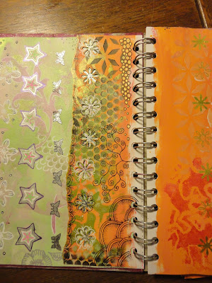
The second session was tearing, punching and drawing! 


This is a much slower process, so we did some in the class, more at home, and there's a long way to go. I still have the pieces that were ripped off and punched out, to add back to these or other pages. I really like the doodling, but I absolutely loved the flowers Paula taught us to draw - for someone who can't draw, I was so chuffed with these!

It also proved expensive - the next time we went shopping I "popped" into Paperchase, and this happened:


Two black drawing pens were added shortly after from the art shop! But I am now very well supplied for drawing! And finding many uses for the pens.

The final session was die cutting, embossing and collage.


These pages looked great in plain white, but I have been brave and covered one in black gesso. The next stage will be to add more colour to highlight the shapes and patterns. I came away with a stash of spare shapes etc, and I have loads of embossing folders and dies at home to play with as well.

Now I have to decide which of Paula's courses I want to do this year! And the Open Door workshops for this term are going up at the moment, so there's more temptation for me!