Saturday, 18 March 2017
Wall of colour
Our second Christmas Card Throwdown for March is a colour challenge.
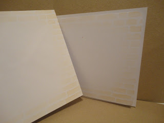
For this one, I started with a brickwork stencil, and sponged through with cream acrylic paint.
Once it had dried (and the stencil had been cleaned) I added antique linen distress ink, and a touch of brushed corduroy, for texture.
(Awful photo I'm afraid, and it's not nearly as yellow as this.)
After cutting down to fit a 6x6 card base (finally breaking my run of 5x7) I stamped words over the "wall". I had a graffiti type idea on mind, although my fonts aren't what you'd usually find spray painted on a wall!
For the main "Merry Christmas" I used Clarity word chain stamps, and claret stazon ink.
I don't have a lime ink, so for the other words I inked up the stamp with yellow then leaf green pigment ink, then went over with light green and light yellow Faber Castell polychromo pencils.
The stamps are Clarity sentiments, and an alphabet set used for the "Noel".
I added a holly stamp to the corners, one I've had for years and love for the detail. I used the pigment inks again, then coloured with the pencils.
To edge, I went a bit grungy (thinking back to the graffiti idea) and used one of my Sheena Douglass distress stamps. The ink is the claret stazon again, but second generation.
I mounted it flat on the card base (with a tape pen), thinking about postage at the end of the year.
For the insert and envelope, I kept it simple, just brushing through the outside of the stencil with antique linen distress ink, to give a frame.
To join in with our colour challenge, head over to the Christmas Card Throwdown, you have until the 31st March, midnight GMT.
Subscribe to:
Post Comments (Atom)


Such a clever card Lucinda! I love the brick wall! I didn't have a lime green either (I didn't actually choose the colours!) but then I finally realised I had Twisted Citron DI which kind of fitted the bill! :-) Xx
ReplyDeleteThanks April. I'll have to look out for the twisted citron, I do like lime! But where there's a will, crafters will find a way!
DeleteQuelle belle réalisation Lucinda, originale et différente, biz
ReplyDeleteMerci Fabiola x
DeleteVery inventive with the lime green. I like the grungy edge. I'm trying to keep my cards flattish but it's quite hard! The post office is stifling our creativity.
ReplyDeleteThey are! If only all my friends and family lived close enough for me to hand deliver all my cards! I think grungy effects look a bit different, and effective, on Christmas cards, I'm trying to do more like that x
DeleteI just love how you used the challenge colors...this card come out absolutely stunning!!!!
ReplyDeleteThanks Ek. And I can do this in so many colour combinations, for my postal cards!
Delete