The last challenge of the year at the 52 Christmas Card Throwdown is nice and open for those last minute cards (or the ones you don't want to enter until they've been received!)
As I have missed a fair few challenges with health issues, this is a chance to catch up on those ones I really wanted to do.
As my favourite colour is purple, I wanted to do the purple and white colour challenge from November.
I started with my gel press plate (the big 8x10 one) and acrylic paints - shades of purple, metallic white and titanium white.
I ended up with loads of backgrounds, but these are my favourites:
This used shades of purple, which I put my Clarity snowflake stencils over, and allowed it to dry while pressing star shaped punchinella into the paint. Once dry I lifted the stencils and used copy paper to lift the wet paint from under the stencils. I then brayered titanium white over and lifted the print. This was about my third print so there were remnants from the previous ones on the plate to add more interest and texture.
This one I added the metallic white paint first, then the stencils and brayerd purple over the top. I lifted the stencils, and stamped into the paint with Clarity snowflake stamps (they work well as they're so deep) and distress oxide inks in purple (I realised I have 5 purples - like I said, my favourite colour!)
This one was a bit of serendipity - it started as a very pale second print that hadn't really worked. But when I lifted the stencils from the previous print, covered in paint, I placed them on here and brayered over to transfer the paint. And I just love how this came out! Unexpected things like this from waste make me very happy.
So this was the first print I used for these cards.
I wasn't sure initially what to do with my lovely backgrounds, then I watched this video from Sam Crowe, and got my inspiration - very different backgrounds but the same layout.
I cut the print to make bases for two 5x7 card blanks (the print is just big enough to do this).
Using some of the waste, as well as the waste from the second print above after cutting a 6x6 base, I cut strips. I stamped on two of these in Gothic Purple stazon, using two very old sentiment stamps, and edged everything with the ink. I also die cut four snowflakes from the second print.
And put together with a lifting flap for movement - with snowflakes matched front and back so it looks good from both sides. This is where you realise your snowflake die isn't quite symmetrical - or the die cuts stretch unevenly while cutting or removing from the die.
This may be a well known card style but I'd never seen it before and really like the movement.
I'd like more contrast between the snowflake and strips on this one if I'm honest.
The paler strips I used here give more contrast, and the sentiment is clearer too.
And I still have lots of purple backgrounds to make more cards with!
To join in with the last 52CCT challenge of the year, head to the blog and enter your final cards.
Merry Christmas!
It's time for my second layers card, for the first of the two challenges I'm hosting on the Christmas Card Throwdown.
This one came from a completely indulgent play session with the gelli plates - my big 8x10 one, and the rectangle from my petites.
I got together a load of acrylic paints in Christmassy colours, Christmas stencils, my brayer and several pieces of stencil card (7x7 and 8.5x11), then went for it! I built up patterns with the big plate first, with and without stencils, and also using what was left on the plate. I pulled prints on parts of the card mostly, rather than the whole sheet. I then used the little plate to fill in details. To start with it all looked a bit disappointing (I didn't take photos, I was just playing!), but as I added more variety and built up the images, some really lovely combinations emerged.
I like some pieces more than others, of course. Some will be cards basically as they are, others will be cut up or die cut, or I may add to them with stamps and who knows what else?
I also got this piece, which was on scrap paper from cleaning the gelli plate.
This is the one I used for this card.
I like elements but wasn't sure about it overall, so perfect for cutting up to make layers!
I chose my background first, and cut the piece down to fit onto a 7x7 card blank. I then looked at what was left - the "Joy" stood out to be a topper, then the rest formed strips to lay across. There was some white on the topper when I cut it, so I coloured it with vintage photo distress ink - but that looked so dull - so I added gold gilding wax - but that looked odd with the gold layer - so I added blue gilding wax, and was happy!
Each piece was layered up onto black then gold - and yes, I did remember to gut the big piece!
I put it all together with tape pen - there are 12 layers in all, so I didn't want too much more dimension.
And the finished card again. It's not perfect - I'd highlight the "Joy" more if my white pen had been working and it hadn't been so late!
But the overall grungy, busy, mixed feel of the card I am so happy with!
To join in with the challenge, pop over to the Christmas Card Throwdown page. You have until midnight BST on Friday 19th May to enter. Enjoy playing!
We're back with another sketch at the 52 Christmas Card Throwdown Challenge this week.
I love this design, it's sparked so many ideas. I have several cards half made using this, and some stash pieces from things that didn't work out, but here's the card I finished.
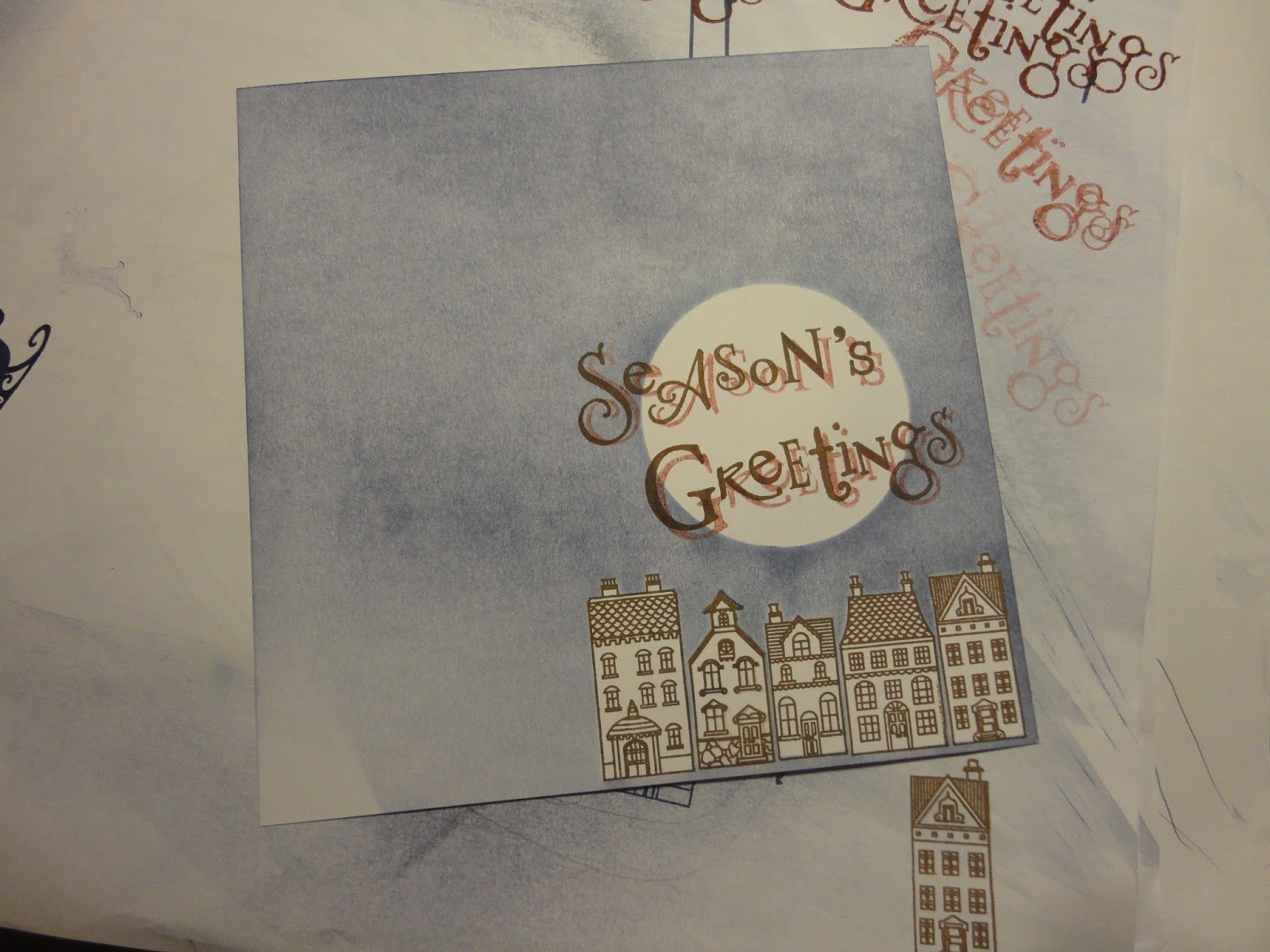
I started with Clarity stencil card, and stamped the wee houses along the bottom, using potting soil archival ink.
I added a mask for a large moon, and also masked the houses (the masks come with the stamps, makes it very easy).
Next I added the sky with chipped sapphire distress ink, using the brayer.
I stamped stars in the background with versa mark, hoping for a resist effect, but they didn't show through the ink.
I used a make up sponge to add ink around the moon and houses, to sharpen up the edges.
With the masks removed, there's a nice contrast.
I brushed a bit of blue across the moon, to tone down the whiteness a little bit.
I stamped a sentiment across the moon, using the Clarity word chains. First time in the potting soil archival.
I took a picture at this stage in case I mucked up the next bit.
I then used aged mahogany distress ink, second generation, for a drop shadow.
Not perfect, could have been straighter and closer to the original, but still like the effect.
I trimmed the card down, and edged with brown sharpie.
Next to add some colour to the houses. I used Faber Castell pencils. Warm yellow for the windows, and red/brown shades to fit in with the line art and words.
For the three squares down the side, I die cut three presents, using a Tattered Lace die.
I cut pieces to fit behind, and brayered ink on in red, brown and blue to coordinate with the background. I didn't like the bows on the die, so cut a different bow using a spellbinders die, and inked though the die to give a white border.
The orginal idea was to have Santa's sleigh going across the moon, which makes more sense of the presents!
This is the first version using that idea, but it was a bit too blue, and I cut it portrait for a 5x7 card base, then didn't have space for the squares. I'll find a way to use this though, maybe add sparkly snowflakes down the side.
This time, I used a 6x6 card base. I mounted the background and the presents on foam tape to raise them up, with the bows on little pads. The top one was off the top of the background, so needed two tiny pads, and a bit of super sticky tape under one of the tails to secure it.
I like the warmth that using the brown tones gives to my favourite blue. It feels much more like a traditional Christmas card.
And I have finally used my wee houses - I wanted these from launch, treated myself in the summer, but hadn't actually put them to use. They're such lovely, detailed stamps.
I'm posting my Clarity Challenge entry on the last day again! At least this month it hasn't been quite the last minute panic of the previous two months.
The theme is "In The Garden", which gives so many possibilities, but I still struggled to come up with an idea that I liked and that worked. After a few false starts I came up with this design, based on the letters of the word Garden.
I spent what feels like hours looking at different fonts in Word to find one I liked. This is called Harrington. I printed it out onto copy paper (my printer wouldn't take stencil card, I did try!). I then traced each letter onto a 8.9cm square of stencil card. Why that size? It's a quarter of a 7x7 sheet.
This where a light panel would have been very useful. I had to improvise with the light box I have for SAD, laid on its back with a large acrylic block on top for a smooth surface.
I carefully drew round each letter with a small permanent pen.
And then filled in with a medium pen.
The results aren't a carbon copy, but I think look pretty good.
I then stamped on each square, a different design on each, using black archival ink. I used pebeo masking fluid, both for over-stamping, and to protect the stamped images while I applied the backgrounds.
So let's look letter by letter.
"G" uses one of my favourite stamps, the Daydreamer. In this case, I extended the tree by repeating higher up, and moved the birds from the left of the tree to the right, to extend the bottom part of the image. The birds on flight added balance and interest - there's one more than planned, drawn in to hide a smudge!
I wanted to try making clouds using cottonwool covered with versa mark ink, but it didn't really work - partly as my ink pad is to dirty the clouds were blue (I'm not great at removing the indexing), and the stencil card reacts differently to Clarity Card. The sky is salty ocean distress ink, with bundled sage and spiced marmalade to add warmth.
All the squares were edged with a black sharpie.
"A" uses a butterfly stamp from the New Design Club. I coloured it with a blue-purple pencil. The background uses the birch trees stencil - I've had this for a while and not used it, although I really like it, so good to have a chance to do so. The inks are antique linen with brushed corduroy and a little ripe persimmon.
"R" has a flower border stamped with the bouquet stamp, and coloured with pencils. The lawn background is mowed lawn (appropriately) with stripes (using the stripes stencil) of bundled sage, to try to tone it down. I hadn't planned these, but got a stripe from the brayer which these disguise perfectly, and I think they work well. I blended iced spruce over the top of it all, to tone down the mowed lawn some more, as it was virtually luminous to start with!
"D" is possibly my favourite, a garden pond scene. The water lilies are from a Japanese set I got from one of the workshops. I masked off the tall stems, to look more realistic and fit the scale better. They're coloured with pencils again. The rushes at the bottom are two wee flowers stamps. I don't think the one is meant to be bull rushes, but that's what it always looks like to me, so it goes in my pond.
The water is bundled sage with a touch of salty ocean. I ran the brayer over crumpled paper before brayering the card, to give the watery texture. It doesn't show that well in the photo, but has worked well.
"E" is where I had a bit of a disaster at midnight last night!
The stamp is a recent New Design Club image, with a bird from the Christmas sentiments set added. They're coloured with pencils. The background uses the maple leaves stencil (another first time use!). I used the "innies" first, with antique linen ink, and a make up sponge.
They were a little indistinct, so I went back with the "outies" and added darker colour - brush corduroy I think. This gave a little halo around the leaves, which I really like. I went over the whole background with a brushed corduroy and ripe persimmon mix, to warm it up.
So far, so gorgeous. Unfortunately, when I was edging with the sharpie, I had a momentary lapse of attention! Hence the black line at the bottom right. No way to remove it, so I had to hide it. I went with another bird - I wanted it facing the other way, so stamped onto scrap, and traced it in reverse with the permanent pen. My light box was pressed into service again. Not perfect, but acceptable. Maybe if I'd slept on it, I'd have stamped another leaf on a separate piece of card, cut it out and stuck it on.
"N" is maybe the prettiest letter. It uses another New Design Club stamp, the carnation. The background is brayered with salty ocean and dusty concord. I was going to colour with pencils again, but my set doesn't have any pinks! So I painted with distress inks. The main colour is seedless preserves, watered down, with picked raspberry and unwatered seedless preserves to add depth. The stems are mowed lawn.
I also used grey pencils to add drop shadows to each square.
To mount, I found, fortuitously, that I had a die that fits well for the square size, it's from a spellbinders set. I then decided that to tie in, I needed a thicker black line round the edges of the squares, so had to go back with my sharpie, and a ruler this time. You can imagine how careful I was!
I cut the die 6 times, in black card, and attached each letter to one.
I then joined them together on a woven textured ribbon, with a large jump ring at the top to hang it from. This was silver, I sprayed it with a little gold to tone it in.
Here's a close up of the top half - of course, something long and thin is difficult to photograph and doesn't really work for thumbnails!
And the bottom half.
I think I could use each of these little scenes separately for cards etc. The "E" would make a lovely Christmas card.
There you have it, my take on "In The Garden".
I wish my garden were as pretty, and varied, as this!
I'm early this week for the 52 Christmas Card Throwdown Challenge. I actually had this finished on Monday morning, but am only just getting to blog it as I'm away at my mum's again.
It's a sketch challenge week:
I decided to go a bit shabby chic with this one.
I started with 8x10 Clarity stencil card, and added colour with distress inks - tumbled glass, iced spruce, salty ocean, chipped sapphire and peacock feathers. I used a mixture of the brayer and blending tool.
I cut into this sheet to get my base layer and the side banner for the sketch.
These I embossed with a Tattered Lace set of folders. I got these ages ago - there were 8 sets being sold as a pack, they include the triangle folders for envelope flaps which are very useful. As I haven't used these ones before, this meets my personal challenge of using something that's been sitting on the shelf for ages! I brayered versa mark over the top very gently, and added mica powder - moon gold and truffle were the names of the colours.
I do like this turquoise and gold combination.
I cut a scrap of the coloured card into a banner for the sentiment, and stamped "Merry Christmas" onto it - I think this stamp set came with a magazine. I used versa mark again and then truffle mica powder.
For the oval, which is my main image, I used some of the Clarity Christmas wee folk stamps. I was going to use the children throwing snowballs, which I haven't used before so they would double up my "stash" challenge, but they didn't fit well into the space, so I went for a personal favourite, the ice skater.
I used more of the card I'd coloured, adding chipped sapphire to define the landscape - a straight line for the frozen pond then a torn paper mask for the hills behind.
I stamped the wee folk Christmas tree behind the hills, and embossed with a platinum embossing powder. Then added the skater, then more tress around the sides and bottom of the oval.
The platinum matches really well with the mica powders I've used.
I used a versa mark pen to draw round the oval (I was using my fiskars cutting plate as a template) and heat embossed the line as well.
I then cut the oval out by hand.
I cut the side banner down to size, to fit a 5x7 card base. To edge the two banners, I did the same as I had on the oval with the versa mark pen and embossing powder.
For the background, I used the pen and then mica powder around the edge, to give a slightly softer look.
I wanted lots of height and dimension, so to construct the card I used foam between the layers, and applied with glue. Unfortunately I was a bit heavy handed, so there was a little buckling of the card where it got too wet.
I also lost the holly from my sentiment, as it fitted better with that part hidden under the side banner.
At this point I thought I was done, and took all my photos.
Look at my little skater girl, isn't she lovely?
The next morning, I remembered the stars from the original sketch, so thought I'd add some gems.
I had pearls and sparkly gems of different sizes that matched the soft gold colour beautifully. I really couldn't decide which to use, but in the end went with these lovely soft pearls.
I'm glad I dug out these embossing folders, I think they look great. For me, this card has a real chocolate box feel. I think it's a combination of the traditional image and the colours. I can definitely see more versions of this making their way into my Christmas card collection.